

When The Software House approached us, they came with a newly defined brand identity and needed a partner who could turn it into a clear, scalable and high-performing website.
As Michał Kowalski, CMO at TSH, shared with us after the project:
“Widelab challenged our thinking in all the right ways. They pushed us to question assumptions, improve our structure and simplify our communication. Since launch, the feedback has been excellent and our conversion rate has gone up. We’re genuinely proud of what we created together.”
Our role was not execution, but partnership - treating design as a business tool, not decoration.
01 - Start with the business, not the layout
We began with a Brand DNA workshop to understand:
- what drives demand for TSH,
- why clients choose them,
- how competitors position themselves,
- which emotional and functional values shape trust,
- and how to turn all this into a conversion-oriented narrative.
This strategic clarity defined everything that followed.
Michał Kowalski, CMO at The Software House
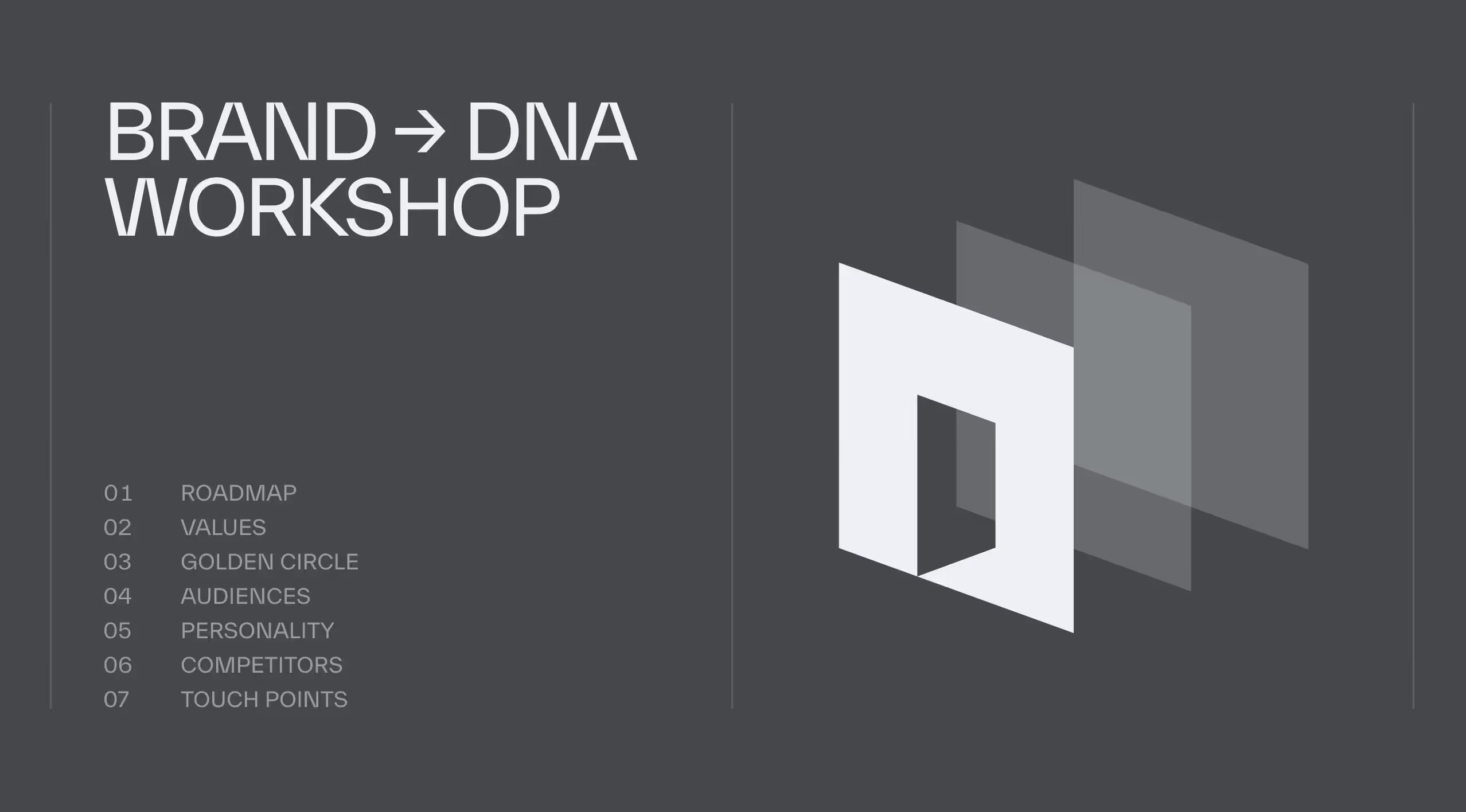
02 - Build a strategic spine
We began with a Brand DNA workshop to understand:
- structured the homepage,
- refined the messaging hierarchy,
- reworked the client’s original wireframe into a clear narrative flow,
- and tightened the section labels and microcopy to make the homepage easier to scan.
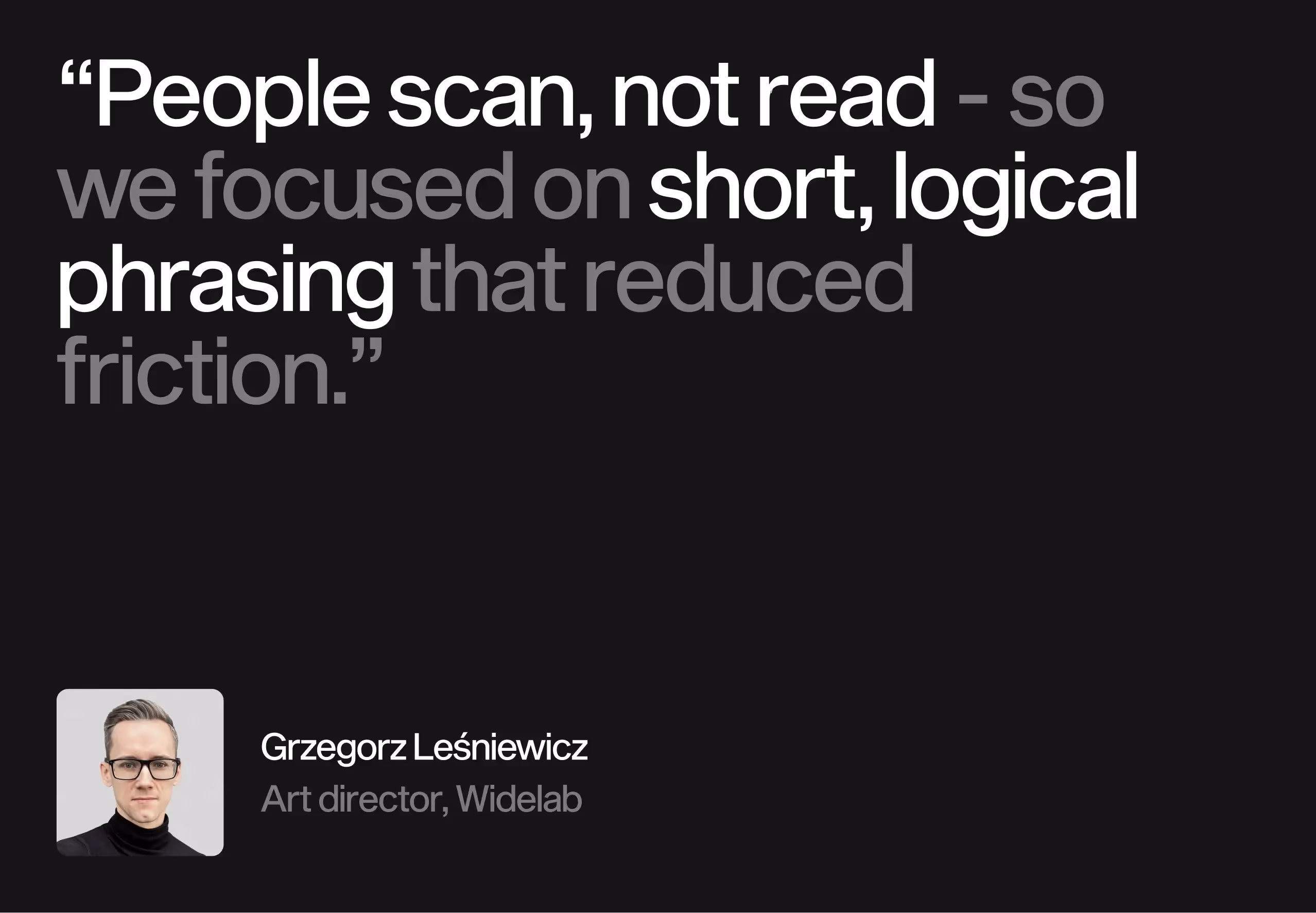
TSH often adopted our proposed copy or lightly adapted it.
This phase covered the full spectrum: brand DNA, UX, business analysis, copywriting and communication design.
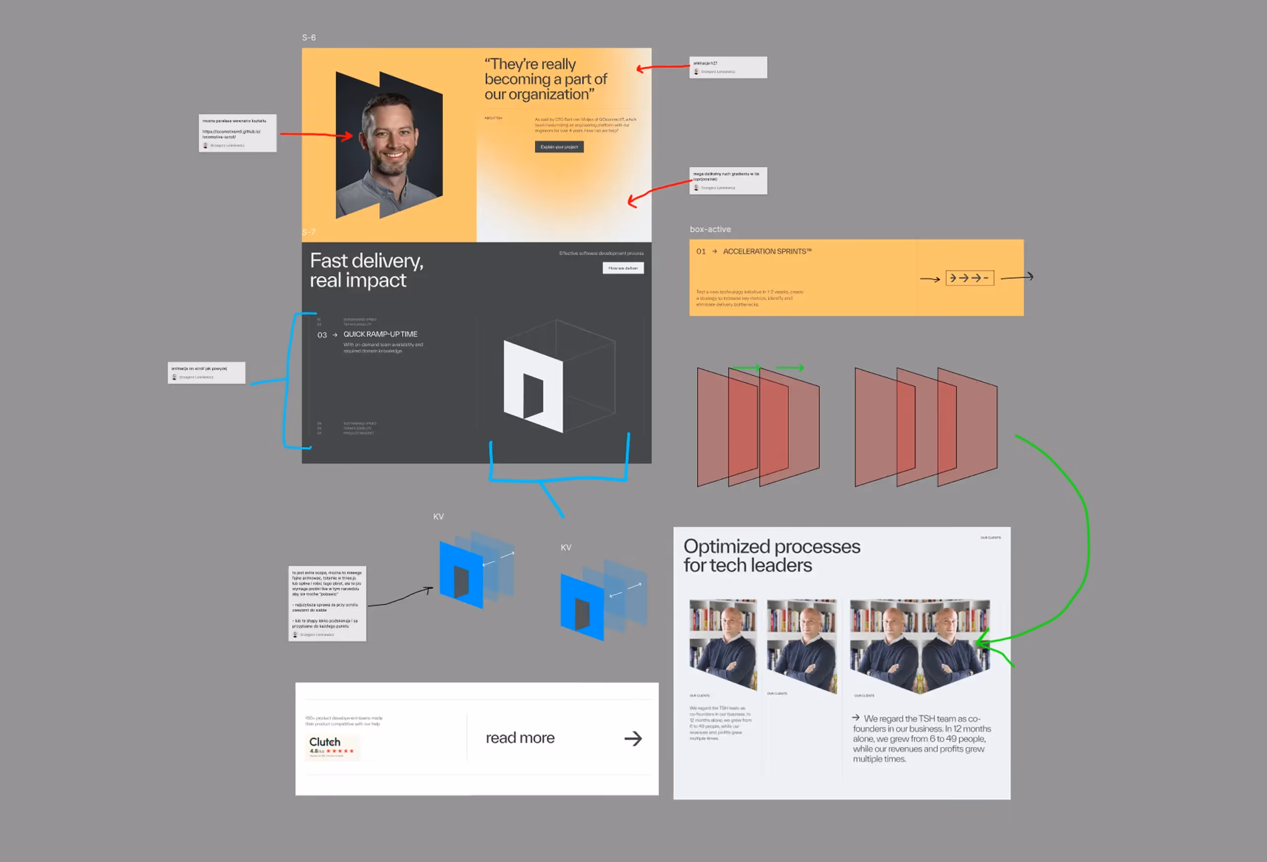
03 - Design draft first
Before touching final UI, we used our proprietary Design Draft method.
→ What is Design Draft?
It is an early, fast, iterative format focused on structure, flow and mechanics - not polish.
It lets us:
- explore variants quickly,
- iterate live during calls,
- validate narrative decisions,
- and lock the logic before refining visuals.
Once the structure was solid, we moved into the polished UI phase - delivering a refined, cohesive visual system.
Originally, TSH came to us only for a homepage redesign. But once they saw the clarity of the process, the quality of the execution and how the Figma system was prepared, they asked us to take over the entire redesign of their digital presence - from core pages to the full component architecture.
04 - Solving the case study thumbnail challenge
TSH had hundreds of highly technical projects, but most lacked visually compelling assets. There were no consistent thumbnails and no scalable way to represent each project.
We created a visual solution:
- a consistent composition logic,
- a recognisable look and feel,
- clear styling rules for type, layout and hierarchy,
- and an initial batch of thumbnails that defined the system.
Extending this to the remaining dozens became simple and consistent, giving the entire case study library visual order.
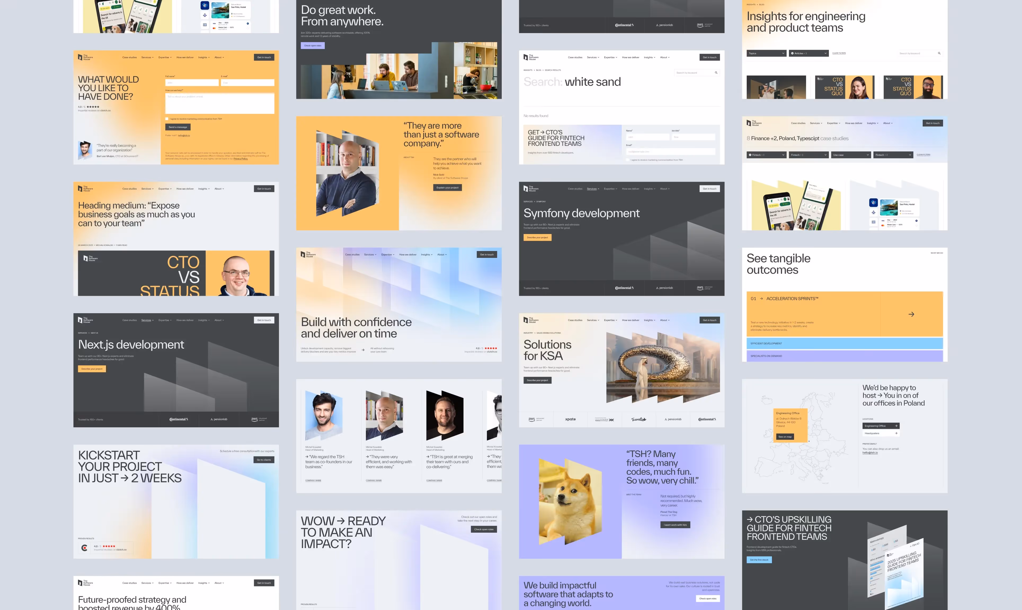
05 - Designing the core page types for a 300+ page ecosystem
TSH’s website consists of hundreds of pages. That scale introduced two core challenges:
- How to give each group of pages its own identity.
- How to maintain brand consistency across all of them.
The branding we received offered enough flexibility to solve both. We defined patterns - shape language, color logic, imagery rules and layout structures - that created distinctiveness while keeping everything aligned with TSH.
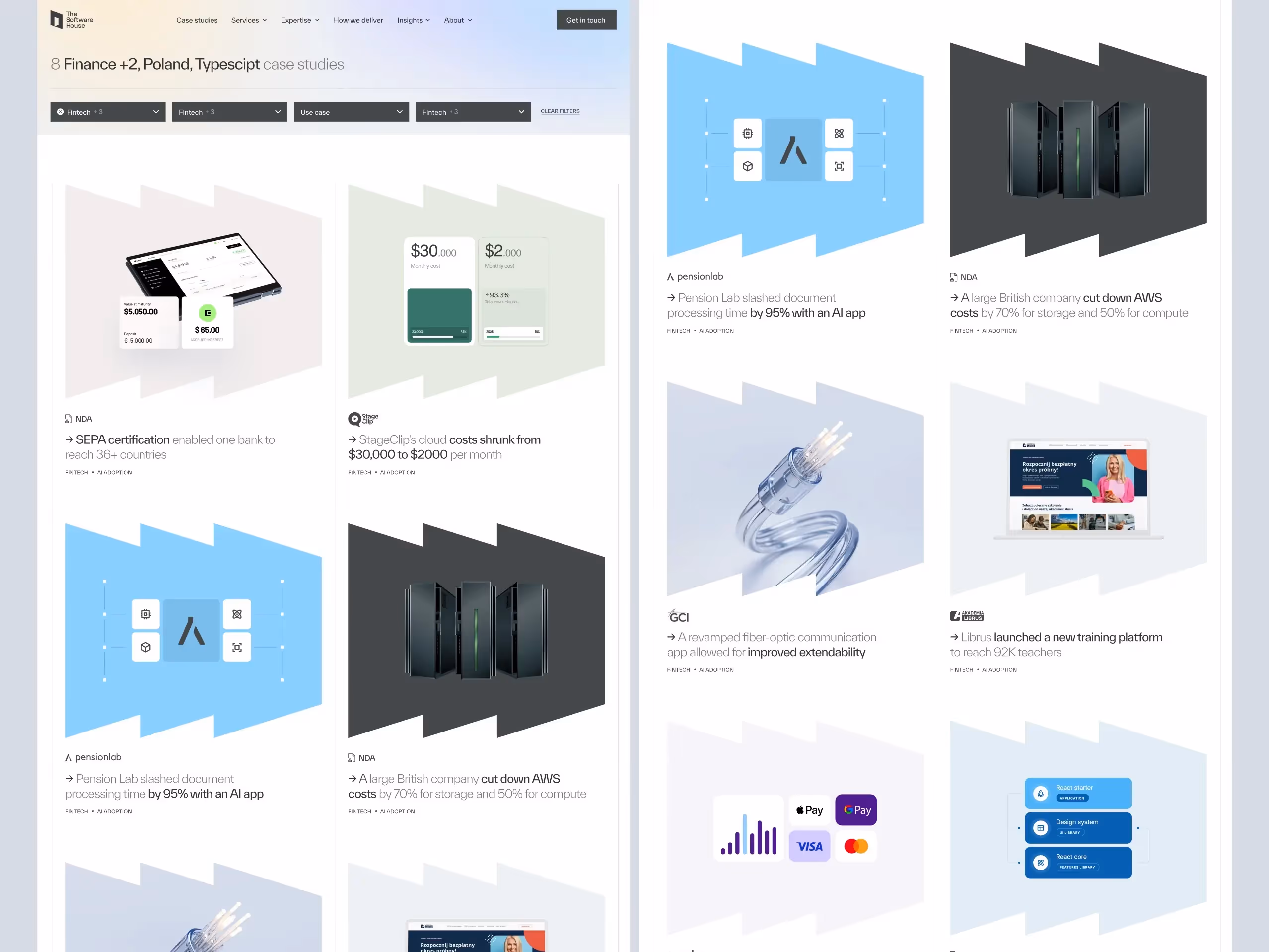
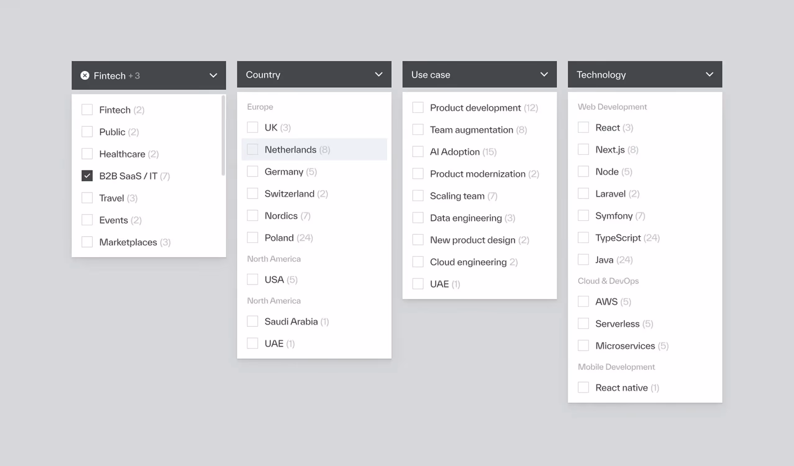
I - Case studies, filters, search & listing
We designed:
- project listing views,
- multi-criteria filters,
- search flows,
- individual case study structures.
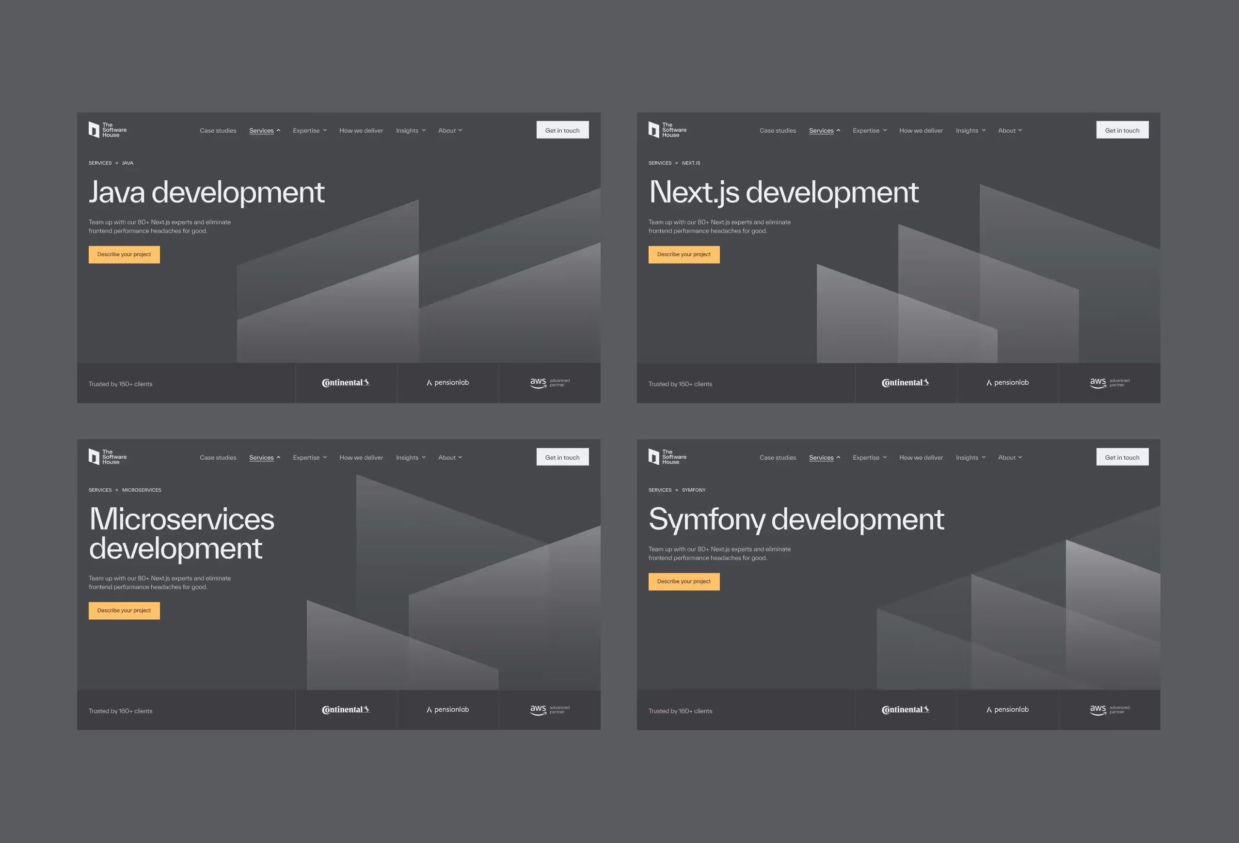
II - Technologies
Across more than a dozen technologies (Next.js, Symfony, Java, Headless CMS, and more), we established:
- dark themes,
- abstract hero compositions,
- modular, rearrangeable sections.
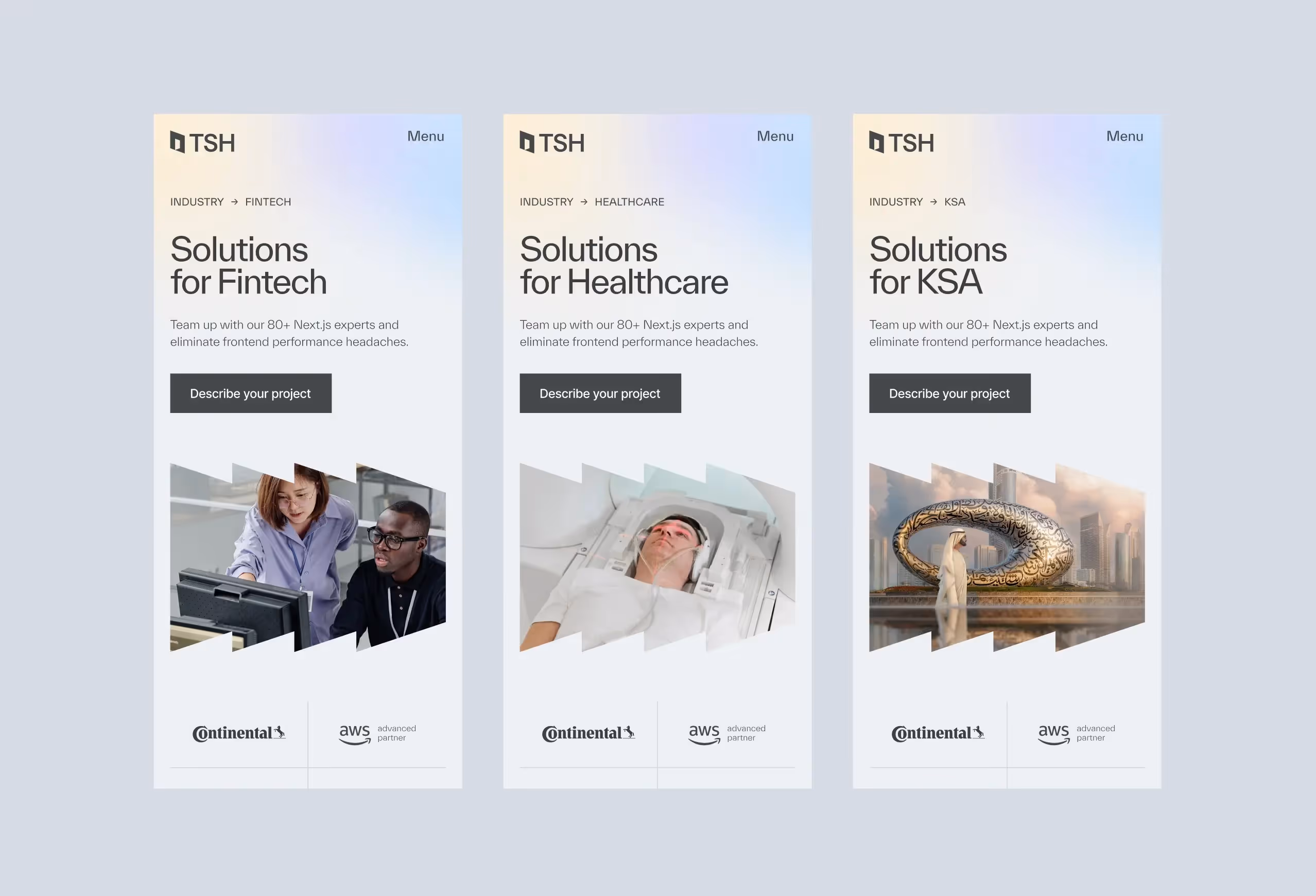
III - Industries
Industries such as Tech, FinTech, Healthcare and Saudi Arabia were built with:
- large hero imagery,
- images embedded into the TSH brand pattern,
- narrative-driven layouts.
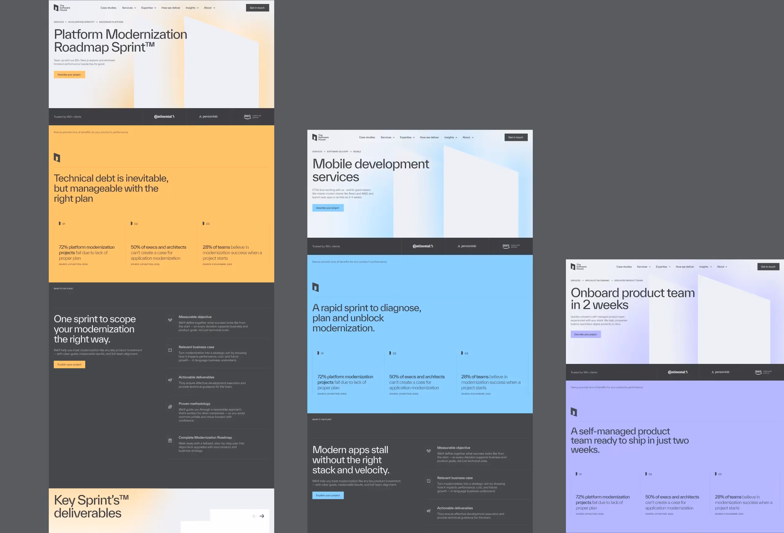
IV - Services
For core services - Acceleration Sprints, Software Delivery and Specialist on Demand - plus their subpages, we built a bold, color-coded system:
- purple,
- blue,
- yellow.
Switching a single token updates backgrounds, gradients and accents across the page.
V - Other pages (ebooks, blog, about, search)
We grouped these into unified long-form and meta-content structures that share spacing, typographic logic and grid consistency.
VI - Careers (separate mini DNA workshop)
We ran an additional workshop to define the employer value proposition and candidate expectations. The careers section was designed as its own experience within the system.
VII - More than 50 unique layouts
Across desktop, mobile, variants and states, we created over 50 key views. These became the foundation for a reusable component library that powers the entire site.
.avif)
06 - Design system
To maintain consistency at scale, we introduced:
1. Typographic scale
Three categories (headlines, titles, body), each with three variants, fully responsive via variables.
2. Color system
Atomic brand-derived tokens - predictable and efficient.
3. Responsive structure
Clear breakpoints for desktop, tablet and mobile.
4. Core UI elements
Buttons, text fields, filters and interaction states.
5. Well-structured Figma setup
We prepared a clean, connected Figma environment where components, tokens and variants update across the entire system.
As the client noted:
“It’s extremely easy to work with this Figma. Changing one thing updates everything else. It saves time, keeps the design consistent and makes collaboration with our dev team much simpler.”
Adapted from our internal system
We used our own proven design system as the base and restyled it to match the TSH brand.
This kept quality high while keeping the design process minimal and efficient.

07 - Outcomes
To maintain consistency at scale, we introduced:
1. 56% increase in leads
Reported shortly after launch.
2. New pages created in ~2 hours
Thanks to modular components, the TSH team can assemble and publish fully implemented subpages in their headless CMS in about two hours.
3. Consistent market feedback
Themes: clarity, structure, recognizability.
As the client noted:
“We’re genuinely proud of what we created together.”
08 - Our approach
1. Business first
We design only after understanding what drives demand, trust and conversion.
2. Challenge for better outcomes
We question assumptions, simplify complexity and build clarity.
3. Systems, not pages
Reusable blocks scale. One-off layouts don’t.
4. Designed for scale
Every detail - from tokens to typography - reduces friction and accelerates growth.

.png)

