.png)
You’re building your first product. Of course, you’re always hoping for success, but unfortunately, failure is always a potential scenario. Most of the time, it happens in one of two ways: either the team spends a year building features nobody asked for, or they cut so deep that what ships feels broken.
Good MVP design helps avoid both. It’s how you put the smallest version of a product in front of real users, see whether the idea stays intact, and do it before budget runs out. This guide covers what it is, how the concept has matured, the process used to scope one out, historically effective models, and the metrics that tell you whether it worked.
What is MVP design?
MVP (minimum viable product) design is the process of scoping, structuring, and shaping the smallest usable version of a product, so it can test a core assumption with real users. A minimum viable product only includes any features needed to deliver the central value of a product, and helps to gather validated learning. The goal isn’t a smaller product. It’s a faster, cheaper answer to the question: does anyone actually want this?
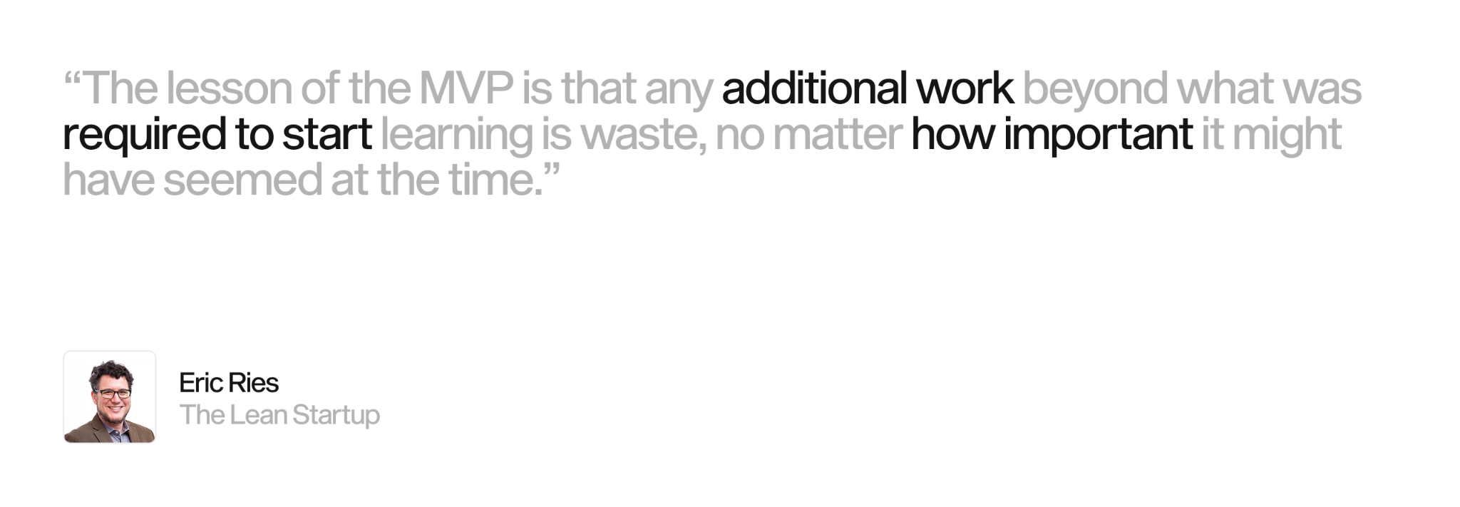
The term comes from lean startup thinking, popularized by Eric Ries in The Lean Startup. His framing is worth keeping in mind: an MVP exists to collect the most learning about customers, for the least amount of effort. Design is what turns that principle into something a person can then open, tap, and react to. Research, prioritization, user flows, and prototyping all sit inside MVP design. Without them, "minimum" can quietly and easily become "unfinished."
From Minimum Viable Product to Minimum Lovable Product
The original MVP idea was a corrective measure. In the mid-2000s, software teams routinely built for months in secret, launched, and discovered the market didn’t care about what they put out there. The MVP said: launch the core early, measure, then decide what to build next. Henrik Kniberg captured the mindset in a well-known sketch, telling audiences not to deliver a wheel, then a chassis, then a finished car - while the customer waits with nothing to drive. Deliver a skateboard, then a scooter, then a bike. That way, the customer can move at every stage, and tell you what they need.
That principle held, but a problem showed up in practice. Teams saw "minimum" and interpreted it as "least effort", resulting in shipping thin, joyless products. Users tried them once - then left. The response was the Minimum Lovable Product, or MLP. It asked the sharper question: what’s the smallest version that people won’t just tolerate, but return to and recommend to others?
The shift matters because attention is so scarce. A file-sync tool that syncs reliably and feels easy to use beats one that technically works but frustrates. Lovable doesn’t mean feature-rich or even perfect. It means one thing done well enough to earn a second visit. In modern digital product design, the target is a first release that’s small in scope and complete in feel.
The minimum viable product design trap: minimal versus broken
Here’s where most MVP design goes wrong. "Viable" and "broken" aren’t the same word, and teams are confusing them constantly. A viable product does one core job reliably and pleasantly. A broken product does several jobs, all of them badly. Cutting scope is the point, but cutting quality is a failure.
The line sits at the core loop. Whatever single action delivers your value, that action has to work every time and feel considered. Everything around it can be manual, absent, or ugly. A booking app can skip filters, profiles, and reviews. It can’t skip a booking that completes without breaking.
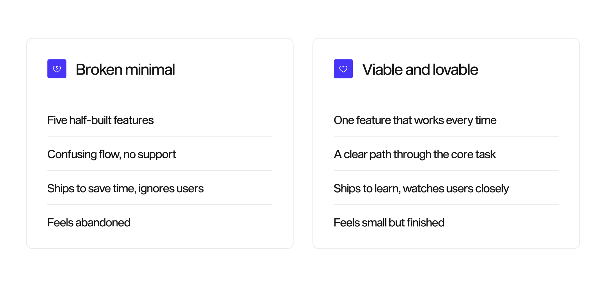
A useful mental model is a "lovable floor." Set the smallest scope that still clears the bar of working reliably and feeling intentional. Anything below that floor is a bug waiting to happen, and doesn’t meet the criteria of an MVP.
The MVP design process, step by step
Scoping an MVP is a sequence of decisions, starting with product discovery, each designed to remove as much risk as possible. Skip them and you end up guessing. Three steps carry most of the weight: mapping the journey, prioritizing hard, and choosing the right fidelity.
Map the user journey
Before you decide what to build, get specific about who uses the product and what they’re trying to accomplish. A user journey maps the steps a person takes - from the moment they arrive with a problem, to the moment it gets solved. That exposes their true path, including the friction points, dead ends, and decisions that a feature list hides behind.
This step is what keeps MVP scoping honest. When the journey is visible, the core loop becomes obvious, and so do the features that only support edge cases. A team that skips straight to a backlog tends to protect pet features, and you lose objectivity. Meaning teams that start from the journey can cut excess with clear evidence. We treat user journey mapping as the input to prioritization, not a separate exercise, because the map is what tells you which steps are load-bearing.
Prioritize features hard with MoSCoW, story mapping, and the Eisenhower matrix
Every stakeholder is going to believe their feature is essential. By prioritizing, you replace subjective opinion with a clear decision, based on data. Several frameworks do this well together.
MoSCoW sorts every feature into four buckets:
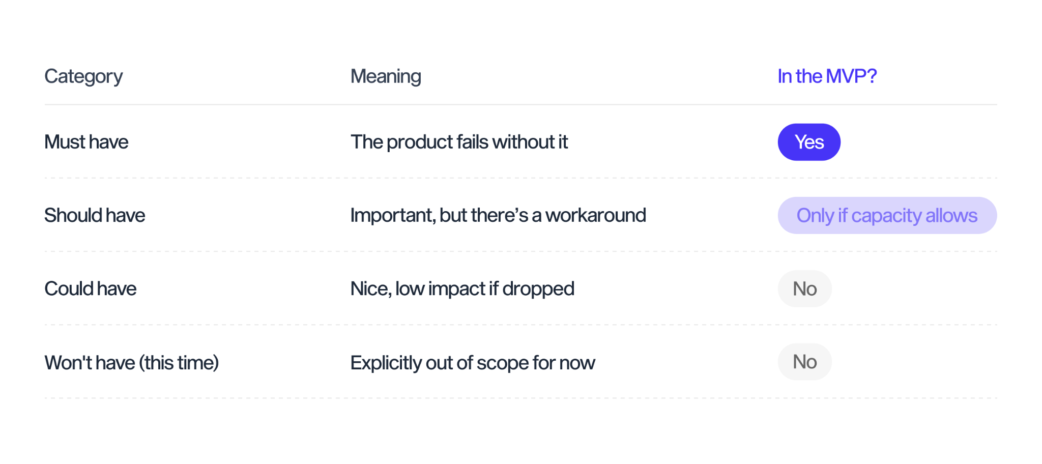
The discipline is in the "Must have" list. If most of the product’s features land there, the sort has pretty much failed. A real MVP usually has a short list of musts and a long, honest "won't have this time" column.
User Story Mapping adds the dimension MoSCoW misses: sequence. You lay out the user's journey left to right as a timeline, or backbone, of activities, then stack the possible features beneath each step. Drawing a line across the map defines a release. Everything above the line ships now; everything below waits. With the map, tradeoffs instantly become visible to the whole team at once, settling debates that a flat backlog can’t. For teams that want someone to run this for them, a product design sprint compresses journey mapping and prioritization into a few structured days of work.
The Eisenhower matrix helps you make quick and easy decisions, split into four categories: Do, Decide, Delegate, or Delete, on an axis of urgency vs importance. The way it usually works is like this:
- Do: If a feature is both urgent and important, you put it here, with clear deadlines or consequences for not meeting them.
- Decide (or schedule): If something is important, but not urgent, perhaps a task that has unclear deadlines but contributes to long-term success, it lands here.
- Delegate: This is the box for tasks that have to get done, but don’t require your specific skill-set and so get passed to someone else - urgent, but not important for your work.
- Delete: The kill box, not urgent and not important. All unnecessary or distracting tasks land here.
Choose the right fidelity: nowadays, usually a clickable prototype
Fidelity is how finished a design looks and behaves. Higher fidelity used to cost more and take longer, so it was matched to the question you were answering, not to how impressive it looks in a deck. In today’s design world, creating an advanced prototype is much faster and simpler thanks to tools like Claude Code and other AI, meaning it often becomes the default option.
Wireframes are low-fidelity layouts. They test structure, hierarchy, and whether a flow makes sense before a single pixel is polished. They’re fast to change, which is exactly why you can use them early, when you expect to be wrong. It can also be beneficial at times to strip away any advanced functionality to allow full focus on just structure, enhancing the ideation process.
A clickable prototype simulates the real experience. Users tap through screens and react as if the product exists. Prototypes answer questions wireframes can’t: is this intuitive, desirable, and will people finish the task?
Use a wireframe when:
- Testing layout and information hierarchy
- The idea is still shifting daily
- You need feedback in hours
- Cost and speed matter most
Use a clickable prototype when:
- Testing usability and desirability
- The flow is stable and needs validation
- You’re preparing for user testing or investors
- The experience itself is the thing to judge
The practical answer is usually both, in order. Start with lo-fi wireframes to settle structure, then move to a clickable prototype once the flow holds. Jumping straight to high fidelity is how teams fall in love with a direction before they have earned the confidence to commit to it.
Proven models, with case studies
You don’t always have to build software to design an MVP. Some of the most effective first products tested demand with almost no code. Several models come up again and again.
Single-feature MVP: Instagram (formerly Burbn)
A single-feature MVP strips a product to its one core function and validates that. Instagram is the sharpest example, because it arrived there by subtraction. It began as Burbn, an overloaded check-in app in the mold of Foursquare: check-ins, plans, points, and photos all crowded onto one screen. When founders Kevin Systrom and Mike Krieger studied the usage data, one signal stood out. People barely touched the check-in features and used the app almost entirely to share photos.
So they cut everything else. They stripped Burbn down to photo upload, filters, comments, and likes, then relaunched it as Instagram on October 6, 2010. The focused app drew 25,000 users on its first day. This is why it beats a build-from-scratch story: it shows the reverse direction. You can reach an MVP by reducing a bloated product to its core loop, not only by building up from zero. Find the one action users value most, then remove the rest.
Wizard of Oz MVP: DoorDash
A Wizard of Oz MVP looks fully automated to the user while people do the work behind the curtain. DoorDash started exactly this way. In early 2013, four Stanford students put up a bare site called PaloAltoDelivery.com: PDF menus from a handful of local restaurants and a phone number at the bottom. There was no dispatch system and no app. When someone called, one of the founders drove to the restaurant, bought the food, and delivered it themselves, often between classes. To the customer it looked like a working delivery service. Behind it were four students and their own cars.
The manual back end answered the only question that mattered at that stage: would people order restaurant delivery on demand? They would. The founders learned the delivery experience firsthand before writing a line of logistics software, then built the real platform on top of that knowledge. Reach for this model when your riskiest assumption is demand, and you can fake the machinery cheaply while the front end feels real.
Concierge MVP: manual and honest
A concierge MVP also delivers the service by hand, but openly. Users know they’re getting a personal, manual version of what will later be automated. A founder onboards each early customer, walks them through the outcome, and learns exactly where the value and the friction sit. Nothing is hidden.
The difference from Wizard of Oz is transparency. Wizard of Oz hides the manual work to test whether an automated product would land. Concierge shows the manual work to learn deeply from a handful of users before building anything. It trades scale for insight, which is the right trade at the earliest stage.
Painted door MVP: Buffer
A painted door MVP, also called a fake door test, presents something that doesn’t exist yet and measures how many people try to open it. Buffer ran the textbook version in 2010. Founder Joel Gascoigne built a two-page site. The first page explained the product, a tool for scheduling social posts, and showed a "Plans and Pricing" button. Clicking it led to a page that admitted the product was not built yet and asked for an email. Once enough people clicked through, he inserted a pricing page in the middle with real plans. The plan a person clicked told him not only that they wanted the product, but what they would pay for it. He started coding only after people clicked the paid plans.
This is the one model here that tests willingness to pay head-on, before a single feature is built. It rewards honesty. A fake door validates only when the "coming soon" page is upfront about what’s happening. If used to trick people into thinking they bought something real, it burns trust instead of building it.
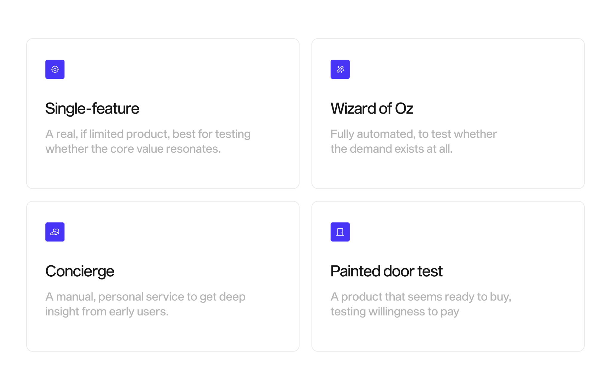
Of course, these approaches have evolved heavily over the last few decades - we’ve moved mostly into digital prototyping, user research, benchmarking, competitor analysis, and many other processes that give us clarity into how true our assumptions about our product are. But the principles remain integral to the idea. Choosing between them comes down to your riskiest assumption: name the belief that, if wrong, could kill the entire product, then pick the model that lets you test it for the least money. This is the heart of MVP prioritization: first, spend on learning, not on features.
Validate with the Build-Measure-Learn loop
Shipping an MVP is just the start of the work, not the end. The Build-Measure-Learn loop, drawn from lean startup practice, turns a launch into a cycle. You build the smallest thing that tests an idea, measure how real users behave, and learn enough to decide what to do next: keep going, adjust, or change direction.
The loop runs in that order for a reason, but you plan it in reverse. Decide what you need to learn first - that tells you what to measure. Only then will you know what to build. Any team that builds first and looks for metrics to track afterward end up justifying what they already made instead of learning from it, so running the loop deliberately is what separates product validation from wishful thinking.
Metrics to track after launch
Vanity metrics feel good - and teach you nothing. Total signups and page views go up and to the right whether or not the product works. You have to track behavior that reflects real value.
- Activation: the share of new users who reach the first moment of value, sometimes called the “aha” moment. If people sign up but never get there, the onboarding or the core loop is broken.
- Retention: whether users come back. For most products, this is the realest value signal. A flat retention curve means people got what they needed and returned; a curve that drops to zero means they didn’t.
- Engagement with the core feature: are people using the one thing the MVP was built to test, or wandering around the edges without engaging?
- Conversion: for a commercial idea, whether users take the action that proves willingness to pay or commit.
- Qualitative feedback: what users say in interviews and support messages, which explains the why behind the numbers.
Set a realistic target before you launch, and decide in advance what result counts as successful validation - plus what would send you back to the drawing board. Judging success after the fact, against a bar you set after seeing the data, is how teams talk themselves into building the wrong thing for another six months.
MVP design FAQ
How long does it take to design an MVP?
Design work for a focused MVP typically runs a few weeks, not months, because the scope is deliberately small. Journey mapping and prioritization take days when the team commits to hard cuts. Fidelity used to be the real variable: wireframes move fast, while a polished clickable prototype ready for user testing takes longer (unless you’re using AI to help speed things up). The scope you protect, not the calendar, sets the timeline.
What’s the difference between an MVP, a prototype, and a proof of concept?
A proof of concept tests whether something is technically possible, usually internally. A prototype simulates the experience to test usability and desirability, and no real users depend on it. An MVP is a real product that live users depend on to get value, built to test market demand. They answer different questions, and strong teams use all three at different stages of development and launch.
How many features should an MVP have?
As few as clear the core loop reliably, but there’s no magic number. The better question is which single job the product has to do well, then whether each feature supports that job or distracts from it. If your "must have" list is longer than the others, then prioritization isn’t finished.
Is MVP design only for startups?
No. Established companies use the same approach to test new lines and features without betting the roadmap on assumptions. The context changes, but the logic stays the same: define the riskiest assumption, ship the smallest thing that tests it, and measure real behavior.
Where MVP design pays off
Minimum Viable Product design isn’t about building less for its own sake: it’s about buying certainty at the lowest possible price. You map the journey to see the real path, prioritize hard so scope reflects value rather than politics, pick a fidelity that matches the question in front of you, choose a model that tests your riskiest assumption cheaply, and then measure behavior that signals real value. Done well, you get your reward. A first product that’s small, complete in feel, and most important: honest about what it’s proven.
The next step is naming the one assumption your product can’t afford to get wrong, then design the smallest thing that tests it. If you want a partner for that, our product teams do exactly this work, and our designers help you conceptualize and build what the evidence tells you to build.

.png)