.png)
Most product decisions get made in a meeting room, defended with a slide deck, and proven wrong six months later by the market.
In comes digital prototyping, breaking that cycle. Instead of arguing about what users might do, you build a version they can touch - and watch exactly how they behave. Any cost of making the wrong call drops from a full development budget down to a few days of design work.
That swap, opinion for evidence, is the whole point. A team that prototypes isn’t smarter than a team that doesn’t - but it’s the team willing to find out what was wrong while the fix still costs a coffee budget instead of a funding round that keeps the engine running long after launch.
What is digital prototyping?
Digital prototyping is the practice of building a testable model of a product, from a rough sketch to a clickable interface, before committing to a full development run. It’s a process that allows teams to put a real interaction in front of users and investors, gather evidence, and decide what gets built - based on data, not guesswork. The model behaves close enough to the finished product to surface the decisions that make a difference.
The key word is: testable. A prototype isn’t just a nicer-looking spec or a polished mockup that sits idle in a deck. It’s something you can use, fail at, react to. That reaction is the product you’re buying when you prototype - everything else, meaning the screens, the animations, the flows, is the apparatus for collecting it. Good prototypes are honest about what they’re testing and ruthless about leaving out everything they’re not.
Stop reading tea leaves: how prototypes catch the wrong product early.
Bugs can be expensive failures in software, but they tend to get caught early enough to allow adjustment. The real kicker is shipping a product that works perfectly, and that nobody wants.
Numbers back this up with uncomfortable clarity. CB Insights' analysis of startup failures found that 43% of failed companies cited poor product-market fit, and 70% ran out of capital, which the firm frames as the final symptom rather than the cause. Why did the capital run out? Because the product missed the mark. The earlier framing of the same research put it more bluntly: 42% of startups died because there wasn’t enough market need for what they built.
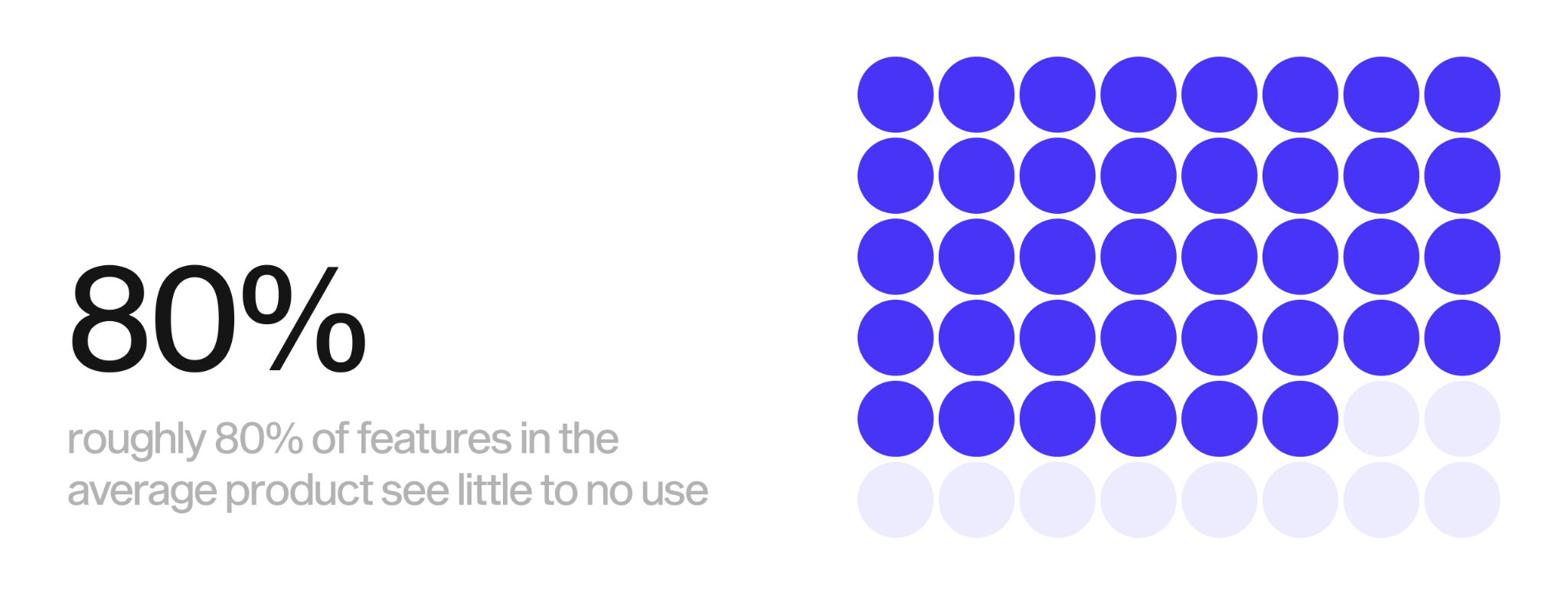
It only gets worse once the thing ships. Research presented by the Standish Group found that 45% of software features are never used, and another 19% are rarely used. Pendo's later analysis of live product data reached a harsher figure: roughly 80% of features in the average product see little to no use. Now look at that as a budget line - it means that the majority of engineering effort in a typical product is spent on building things that users ignore.
A prototype attacks both problems before they cost anything. You find out whether the core idea lands while it’s still a clickable file, and which features earn their place before a developer touches them. The wrong product gets caught at the stage where killing it is a choice, not a write-off.
Drew Houston understood this before he built Dropbox. Cloud sync was technically hard and slow to build, so instead of spending months on infrastructure, he recorded a short demo video showing how the product would work and posted it where early adopters gathered. The beta waitlist jumped from around 5,000 to 75,000 signups overnight. The product in the video didn’t really even exist yet, but the demand it proved was real, pulling the company into a closed beta that reached a million users within a few months. Houston validated the market with a prototype, then guided engineering into following the proof.
That’s the move. Build the cheapest possible thing that might be wrong, but put it in front of real users and let them tell you what the next build should be.
The cost of being wrong isn’t linear, which is what makes late discovery so crushing. Catching a faulty assumption in a prototype is a one-line fix, but imagine spotting it after launch - then it’s a rebuild. The codebase, data model, and even the team’s mental picture of the product get shaped around it. Each week you work on an unvalidated idea, it grows more expensive to question and rewrite. Prototyping front-loads the doubt while it’s still cheap enough to act on.
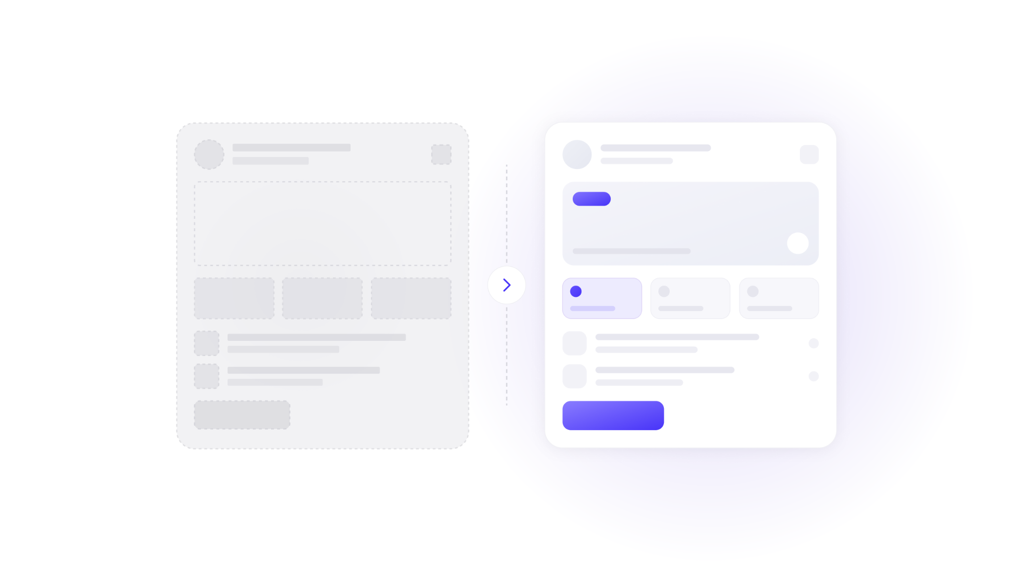
Lo-fi vs hi-fi: which prototype the job needs.
Not every question needs a clickable, near-real product to accurately test it. Matching the fidelity of the prototype to the question you’re asking is where teams save the most time, and where they tend to overspend.
A low-fidelity prototype is fast and deliberately rough. Think sketches, greyscale boxes, or a clickable wireframe in Figma with placeholder text. It answers structural questions: does this flow make sense, is the information in the right order, do people understand what this screen is for. Because it looks unfinished, people can focus on critiquing the idea and bigger picture, rather than getting hung up on the colour of a button or font size. Making one can take as little as a few hours, and throwing it away doesn’t make you flinch.
A high-fidelity prototype looks and behaves like the real application. Real copy, real visual design, working interactions, realistic data. It answers experience questions: does the interaction feel right, will users complete the task without help, does the product earn trust on sight. It’s the version you put in front of an investor or run a usability test against, because it removes the imagination tax. Nobody has to picture the finished thing - it’s right there in front of them.
Here’s how to pick.
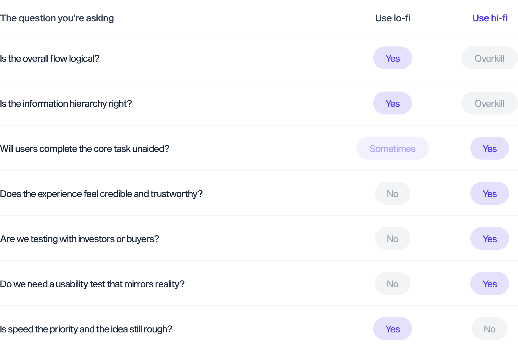
The mistake that burns the budget is jumping into high fidelity too early. Polishing pixels on a flow that hasn’t been validated is the design equivalent of decorating a house with no foundation. Start rough, prove the structure holds, then add fidelity only where a real decision depends on it. Widelab's own process runs this way by default, beginning with a lo-fi mockup and evolving it into a high-fidelity design once the bones are confirmed.
The reverse mistake can be just as damaging. Testing a fundraising pitch or a paid usability session with grey boxes wastes the session, because the people in the room can’t react to an experience that isn’t there. Spend the fidelity where the decision is expensive. Skip it where the decision is cheap.
A practical sequence works for most products. Sketch the flow on paper or a board first, when changing your mind costs nothing. Move the version that survives into a lo-fi clickable wireframe and test whether the structure holds. Once it does, invest in a high-fidelity build for the experience and credibility tests. Going through each stage you discard what failed at the one before it, so you’re never polishing a screen that hasn’t been earned in the flow.
It’s also worth noting that with the advent of evermore powerful AI tools, producing quality hi-fis in a matter of hours or days is becoming standard practice for advanced design agencies. A solid design engineer with a good proof can deliver a strong first hi-fi model that ultimately negates the need for any time spent developing lo-fis. After all, why go for something basic when the more advanced version can take just as long to deliver?
The founder's fundraising tool: proof before a line of code.
For a founder, a prototype isn’t a design artifact or empty spend - it’s your entire leverage.
Investors don’t just fund ideas because they think they’re great - they look at risk and reward, and a prototype is the cheapest risk reduction a founder can buy. Pitch decks describe the future. Clickable prototypes let the investors operate in that future for 1-2 minutes. The difference in a room is enormous. The first is you asking the investor to trust your description, your vision - the second gives them evidence they use to convince themselves.
The Dropbox waitlist was exactly this kind of asset. Houston didn’t walk into Y Combinator with a hypothesis about demand, he walked in with 75,000 people who had already raised their hands to say: “I want this.” The prototype generated proof, and the proof did the persuading. A signup list, a recorded usability session, a short video of a real user breezing through your core flow: each one replaces a claim with a fact.
This is also the fastest way to sharpen the pitch itself. When a founder watches three investors stumble over the same screen in a prototype walkthrough, the next deck writes itself. The objections surface before the meeting that counts, while they’re still fixable in an afternoon.
Widelab has built this leverage for founders directly. The team designed the fundraising pitch deck and product story for companies raising capital, and worked with Founderpath, a platform that exists specifically to help SaaS founders raise money without giving up equity. The pattern across that work is consistent. Tangible, testable proof moves a fundraising conversation further than 45 minutes of confident narration, and costs a fraction of the round it helps unlock. Our designers are currently able to build advanced prototypes using Claude for Founderpath - within just a few hours, instead of days.
A prototype also aligns the people building the company, not only the people funding it. Co-founders can argue for weeks about a feature in the abstract, then agree in seconds the moment they watch a real user struggle with the screen in question. The prototype becomes a shared source of truth that settles debate with evidence instead of seniority or volume. That internal alignment is quieter than a term sheet, and it prevents an enormous amount of wasted build time before the build even starts.
The sequencing is the key here: build the prototype, raise on the proof, then write the code. If you’re a founder who’s reversing that order, you’ll probably spend the seed round discovering whether the market even exists. Founders who prototype first arrive at development with the answer already in hand.
Crash-testing your idea with the market in seven days.
What’s the strongest argument for digital prototyping? The speed of being wrong.
Six months of development to find out an idea misses is a catastrophe. Seven days of prototyping and testing to find out the same thing - that’s a Tuesday. The information is identical, only the price changed, and it changed by a factor large enough to decide whether a company survives the harshest of lessons.
A focused validation sprint compresses the whole loop. Build a clickable prototype of the core flow, recruit a handful of real target users, run moderated sessions, and read the results. Widelab runs user testing in two to three business days and full product discovery inside two weeks, with user testing consuming roughly 10% of the average project budget while evaluating close to 90% of the design work. That ratio is the entire case for prototyping in one line. A tenth of the spend, checking the part most likely to sink the project. With AI support, clear analysis, and a strong scenario, the work gets done quicker than ever.
Inside seven days, you get answers to questions that otherwise wait for launch: do people understand the value in the first ten seconds? Can they finish the task you designed the product for? Where might they hesitate, misread, or even give up? Would they pay to use it? Every single answer either confirms the direction or saves you the hassle of building the wrong one. A prototype turns questions from post-launch regret into pre-build confidence.
A one-week validation sprint usually produces four things worth more than the time they cost:
- A clickable prototype of the core flow, built to enough fidelity to test honestly.
- Recordings of real target users attempting the main task, with friction points marked.
- A short, specific list of what to change before any code gets written.
- A clear go, adjust, or stop decision, made on evidence rather than enthusiasm.
Compare the two paths honestly. One team spends two quarters building, launches, watches the analytics flatten, and starts a painful rebuild on a codebase already shaped around the wrong assumptions. The other team spends a week, learns the same thing, adjusts the prototype, tests again, and only then commits engineers to a direction the market has already approved. Same destination. One path costs a runway, the other costs a sprint.
Zappos started this way, before it was Zappos. The founder photographed shoes in local stores and listed them online to test whether people would buy footwear they couldn’t try on or see in person, fulfilling early orders by hand. No warehouse, no inventory, no platform. A test of the core assumption the entire business depended on, run for the price of a few afternoons. The market answered - the building followed.
Digital prototyping FAQ
What’s the difference between a lo-fi and hi-fi prototype?
A low-fidelity prototype is rough and fast, usually sketches or greyscale wireframes, and it tests structure and flow. A high-fidelity prototype looks and behaves like the real product, with real design and working interactions, and it tests experience, usability, and credibility. You can use lo-fi to validate the idea cheaply, and hi-fi when you need a realistic test or a fundraising-grade demo. Nowadays, the standard practice is to use hi-fis due to the speed at which they can be generated.
How long does it take to build a clickable prototype?
A focused clickable prototype of a core flow can now be ready in hours, not weeks. A full validation cycle, building the prototype complete with UI/UX, interactions, flows, and then testing it with real users and reading the results - all fits comfortably inside one week for a well-scoped product.
How much does digital prototyping cost?
Far less than building the wrong product. A prototype and validation sprint typically costs a small fraction of full development, and it protects the much larger sum you would otherwise spend building features nobody uses. The exact figure depends on scope and fidelity, which is worth validating before you commit.
Can a prototype help raise funding?
Yes. A clickable prototype lets an investor experience the product instead of imagining it, and it lets you attach real evidence to the pitch, signup interest, usability results, or a recording of users completing the core task. Proof moves a fundraising conversation further than a description.
What tools are used for digital prototyping?
Most teams build clickable prototypes in Figma and Claude Code, and some may still use collaborative boards like FigJam or Miro for the earlier mapping and lo-fi stages. The tool matters less than the discipline behind digital prototyping: putting something testable in front of real people early.
Build the product the market already approved.
Guessing is the most expensive thing a product team can do, because the bill arrives after the build. Digital prototyping moves the bill to the front, where it’s small and survivable. You learn what to build, what to cut, and whether to build at all, while every answer is still cheap to act on.
The next step is simple. Take the riskiest assumption in your product, the one that, if wrong, sinks the whole thing, and build the smallest prototype that can test it.
If you want that prototype built and validated fast, get a quote on a clickable prototype from Widelab and put your idea in front of real users before you write a line of code.