A prospect downloads your app, taps "Open account," and reaches the identity verification screen. Then they close the app, never to return.
This sounds dramatic, but it happens a lot more than most founders realize. Signicat's Battle to Onboard research found that 68% of European consumers have abandoned a financial application partway through, up from 63% in 2020 and 40% in 2016. Strong fintech UX design is what separates the products that convert traffic from the ones that pay to refill a leaking funnel.
This guide covers the psychology, the hard rules, the mistakes that quietly kill conversion, and where the discipline is heading in 2026.

What is fintech UX design?
Fintech UX design is the practice of shaping how people experience financial products, from onboarding and identity verification to dashboards, payments, and error states, so the product feels safe, clear, and worth trusting with your money. It sits at the intersection of usability, behavioral psychology, and regulatory constraint. A financial interface has to convert, while bearing the weight of obligations that a photo-sharing app never worries about.
That last part makes it so difficult. A consumer product can chase frictionless signup with fewer consequences, but a fintech product has to satisfy Know Your Customer (KYC) and Anti-Money-Laundering (AML) rules, protect sensitive data - all the while feeling effortless enough that someone completes the flow. The design job is to hold those forces in tension, rather than pretending either one of them doesn’t exist.
The psychology of trust in fintech
If you read a lot of guides on this topic, most of them will tell you that the key is removing any friction. That’s half right, and if taken literally, likely dangerous. In finance, the goal isn’t simply ‘zero friction’ - it’s legible friction. These are moments where the interface purposefully slows the user down and makes it clear why. Get that distinction wrong, and you end up bleeding conversions or even worse, building a product that feels too easy to be safe to use.
Users decide whether to trust you in seconds
People form a first impression of a digital interface almost instantly, and in finance that impression carries even more significant weight. A messaging app that looks slightly off is pretty much just annoying. But a banking app that looks a little weird or unfamiliar? That triggers one of the biggest fears in consumers: is my money safe here?
Visual polish, consistent spacing, predictable behavior, and clear language aren’t just cosmetic or aesthetic-driven in fintech. They’re the first evidence a user has that the company behind the product is competent enough to hold their savings, and established enough to be accountable for their wealth.
Two behavioral forces make this harder than in most categories. The first is loss aversion: people feel the prospect of losing money far more sharply than the prospect of making it, so any hint of risk weighs heavier than any promise of reward. The second is cognitive load. Financial decisions take a lot of effort on their own, and every singly ambiguous label, unexpected step, or dense screen adds to a mental burden the user is already reckoning with. Good fintech UX design works by decreasing the load at the exact moments anxiety might spike - in a financial product, that’s usually during onboarding, the first transaction, and any screen where money is leaving the account
Good friction and bad friction aren’t the same thing
Bad friction is anything that costs the user effort without giving them a good reason: a form that asks for data you don’t need yet (or at all), an ambiguous error, or a dead end screen with no clear next step. Good friction is a deliberate pause that signals care, and attention - this could be a confirmation screen before making a large transfer, or a biometric check at the moment money is being moved. Even a short explanation of why an ID document is required to make something happen.
There’s a mountain of evidence to back this up. Signicat's research found that more than half of consumers are willing to accept a more complex application if they know that the added steps will help to reduce fraud. In this segment, contrary to what most industries see, users aren’t asking for the shortest possible path. They’re asking to understand the path. When the reason is visible, friction becomes a trust signal instead of a drop-off point.
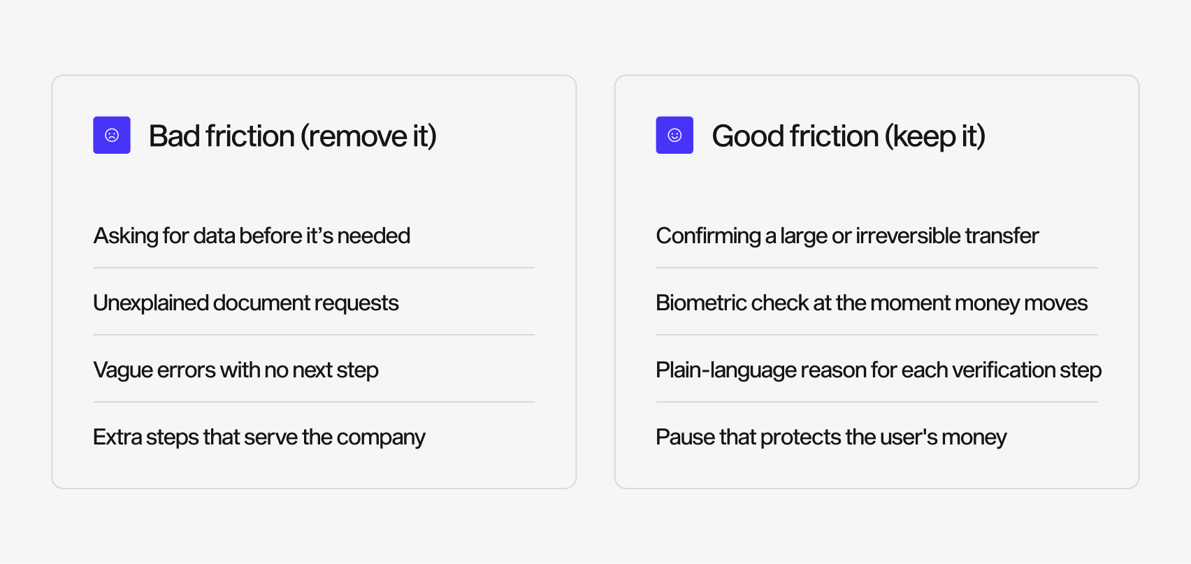
The rule of thumb: friction that protects the user builds trust, and friction that serves the company burns it. Every added step should be defensible from the user's side of the screen, not just the company bottom line.
Show, don’t tell
Trust in fintech is earned through visible behavior, not reassuring copy or platitudes. When a transaction completes, the user should see it confirmed in real time; when something changes, the interface should say so; when there are errors or delays, they should be notified immediately. Real-time feedback, progress indications, and clear confirmation states do way more for perceived security than any ‘back-grade encryption’ badge sitting in a footer, or fine print guarantees of safety. People believe what the product shows them far more than what it tells them about itself.
Core principles of high-converting fintech UX design
Trust psychology is what sets the strategy. These principles turn that into clear interface decisions, and together they form the practical core of fintech UX design.
Stage the onboarding, defer the heavy lifting
The strongest fintech onboarding flows collect the minimum data they need to get started, let the user explore the product on their own, and only trigger full verification when it’s relevant - usually at the first money-moving activity. Revolut is an excellent example of how to do this: it opens with really light data entry and progressive disclosure, only asking for deeper verification at the point where the user is invested and has a reason to complete it. This sequencing matters because Signicat found that 38% of abandoners quit over missing identity documents, and 21% because the process took too long. Front-loading every requirement guarantees you hit both walls before the user is invested.
Surface the one number that matters first
A fintech dashboard will always fail if it treats every data point as equally crucial. But it’ll succeed whenever it answers the user’s first question immediately, which in fintech products is usually: how much do I have? Account balance and primary actions belong at the top, while secondary tools, budgeting, vaults, analytics, all sit one layer deeper. A strong visual hierarchy and generous white space are how you keep a data-dense product from feeling like a spreadsheet - especially when you’re being asked to trust it with your salary and expenses.
Design navigation for genuine complexity
Financial products accumulate features quickly, because they’re more comprehensive and agile than traditional banking services: accounts, cards, transfers, investments, statements, settings, roles, memberships, virtual cards, the lot. Navigation architecture is where that complexity either resolves into something learnable or collapses into complete chaos. Group features by user intent rather than like an internal org chart, and keep high-frequency actions reachable in one tap. Make the current state obvious at all times - in finance a user who’s unsure where they are won’t stop to guess. They’ll just stop.
Treat accessibility and compliance as design inputs, not paperwork
Accessible contrast, readable type, keyboard and screen-reader support, and clear regulatory disclosures are constraints you design with, not around. A KYC step, a consent screen, or a fee disclosure - these can be moments of clarity that build a user’s confidence in your brand and product, or you can reduce them to a wall of legal text that feels like a red flag. The difference comes entirely down to how it’s designed on the screen.

Accessibility is also a trust signal in its own right. A product that’s hard to read or operate tells a subset of users that they weren’t considered - and with user demographics for fintech changing dramatically and now including key segments from across different age groups, geographics, ableness, and more, anything that isn’t accessible makes the user feel overlooked, and unsafe. You might view designing for a full range of abilities, devices, and contexts as a compliance checkbox marked ‘done’ at the end of the process, but it’s more than that. You’re widening the addressable marketing and reinforcing the same message the rest of the interface is working hard to send: this product was built with care, by people who know what they’re doing and are thinking of you. Treat every mandatory disclosure as an opportunity to demonstrate that, rather than a hoop to clear.
Fintech UX writing: microcopy that lowers anxiety
In a financial product, words carry just as much of the trust load as the layout. UX writing is a crucial part of the interface, a grounding and reassuring element that also happens to look appealing too.
The rules are specific. Use plain language over jargon, so phrases like "we couldn’t verify your card" beat "transaction declined: error 402." Reassure the user at moments of hesitation with lines like "you can change this later" or "your data is encrypted and never shared." Write error states that say what happened and what to do next, never leaving them at a dead end. And name the reason behind any step that asks for sensitive data, because an unexplained request for a passport reads as suspicious, while an explained one reads as protection.
The test for fintech microcopy is simple. Two questions: would someone who’s never used a fintech app before understand this? And does this sentence reduce the user's anxiety or add to it? If it does neither, it’s taking up space a reassurance could fill instead.
Case study: what Revolut gets right, and what it teaches
Revolut is an example worth studying here - it turns compliance-heavy processes into a flow that feels light without hiding what’s happening. Three patterns stand out.
First, onboarding is mobile-first and progressive. Rather than dumping every field on one screen, it introduces steps gradually and defers full verification, which keeps early drop-off low while still meeting KYC obligations. Second, it presents verification as a signal rather than a chore, showing progress and setting expectations so a regulatory requirement reads as evidence of a serious operator. Third, it relies on real-time feedback: transactions confirm instantly, and the interface keeps users informed at each step, which is the "show, don’t tell" principle applied end to end. All of this is sufficiently gamified to make the user feel like they’re completing an easy form or quiz, with the reassurance of financial security.
A fourth pattern is worth pulling out here: microcopy. Revolut's flow uses language that keeps momentum without overselling, framing verification and setup as steps the user already wants to take towards a payoff, rather than any obstacles between them and managing their money. The does a really specific job, which is keeping a regulation-heavy process feeling authentic and human.

The lesson generalizes beyond any one app. At Widelab, our fintech UX design work runs on the same logic. On Ryd, the refuel-and-pay mobility app, we ran a full UX audit to find exactly where the payment experience created hesitation and where trust broke down. On a payments infrastructure product, the design work centered on making a technically complex offering feel approachable to the businesses evaluating it. On a crowdfunding platform, we ran discovery, prototyping, and user testing before committing to an interface, because a product that asks people to move money toward strangers has to establish trust before it asks for anything.
In each case the pattern held: the interface has to earn trust before it can ask for a transaction. That’s also why more than 80% of our clients are still working with us two years after the first project. Products that earn trust get to keep it, and so do the teams that build them.
The five most common fintech UX mistakes that kill conversion
Early-stage fintech products tend to fail in very predictable ways. These are the ones we see most often.
- Asking for everything up front. Requiring full verification before the user has seen any value is the fastest way to trigger the 68% abandonment problem. Stage it instead.
- Hiding fees and terms. Surprise costs late in a flow destroy trust instantly and permanently. Surface fees in context, at the moment they apply.
- Ambiguous error and empty states. A blocked user with no explanation and no next step is a lost user. Every dead end is a conversion leak.
- Designing the dashboard for the company, not the user. Cramming every metric onto one screen because a stakeholder asked for it can bury the number the user opened the app to see.
- Treating security as invisible. Real protection that the user never perceives does nothing for trust. Make safety visible through confirmations, feedback, and honest copy.
None of these are exotic, or even difficult. They’re the difference between a product that converts its paid traffic and one that doesn’t, and most of them surface clearly in a structured UX audit before they cost you a single user.
Fintech UX design trends shaping 2026
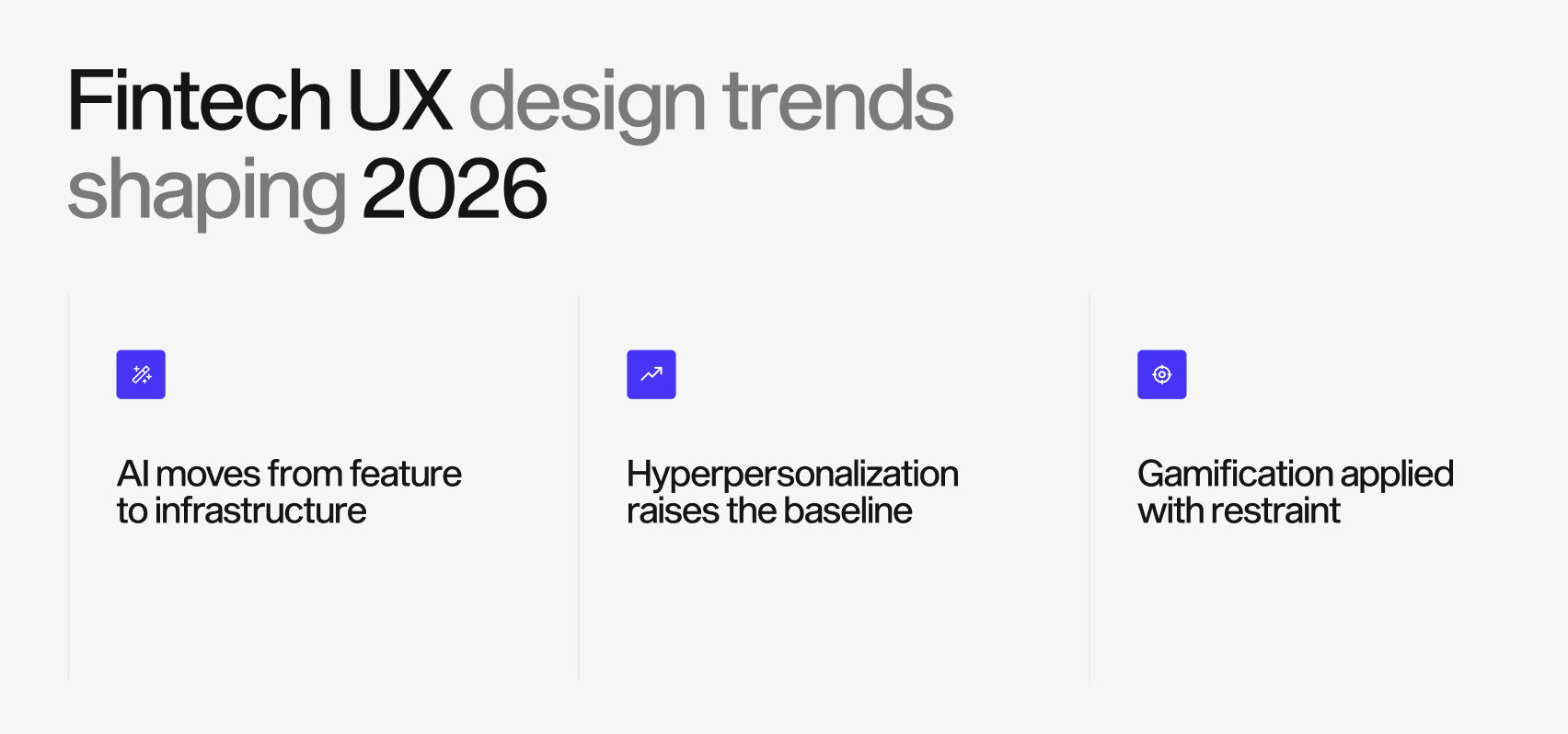
Three shifts are changing what good looks like this year.
- AI moves from feature to infrastructure
AI is long past the days of being a bolted-on chatbot. It’s being used to recover abandoning users mid-flow, pre-fill and validate onboarding data, detect anomalies without adding visible friction, and answer support questions inside the moment of confusion rather than through a separate help center channel. Given that the average applicant now abandons a financial flow in under nineteen minutes, according to Signicat, catching hesitation the moment it happens is where AI earns its place. The design challenge is deploying it where it silently reduces effort, not where it adds another interface to learn. An AI feature that the user has to manage on its own is the worst kind of friction - because it’s wearing a helpful mask.
- Hyperpersonalization raises the baseline
Users increasingly expect the product to adapt to them. Dashboards that reorganize around actual behavior, onboarding that asks about financial goals and tailors what follows, and tips that reflect real usage are becoming table stakes. The line to watch is consent: personalization built on data the user didn’t knowingly share erodes the exact trust it’s meant to build. With 92% of consumers concerned about how financial providers use their data, transparency about personalization isn’t optional.
- Gamification, applied with restraint
Progress indicators, streaks, goal tracking, and rewards can lift a user’s engagement with saving and investing, but only when they reinforce genuinely good financial behavior. They backfire when they nudge users toward risky activity, treating trading like a slot machine. In fintech, gamification has to serve the user's financial health, not just the company's engagement metrics, or it becomes a liability the moment a regulator or a journalist looks closely.
Fintech UX design FAQ
What makes fintech UX different from other UX?
It has to build trust and satisfy regulation at the same time. Every design choice carries a "is my money safe" subtext that consumer products rarely face, and compliance steps like KYC are part of the experience rather than a separate layer.
How does UX design affect fintech conversion?
Directly. With 68% of financial applications abandoned mid-onboarding, the flow itself is often the biggest conversion lever a fintech has, ahead of pricing or marketing. Fixing where users hesitate usually returns more than acquiring more traffic.
Should fintech products remove all friction?
No. Remove friction that costs effort without a reason, and keep deliberate friction that signals safety, like confirmations before large transfers. Users tolerate steps they understand.
How do I know where my fintech product is losing users?
A structured UX audit maps the flow against real behavior and pinpoints where hesitation and drop-off happen, which is where the recoverable revenue sits.
Where to start
The core idea is simple enough: in fintech, trust is the product, and UX is how you build it. Legible friction, staged onboarding, clarity over cleverness, and honest copy do more for conversion than any growth tactic layered on top of a flow that quietly frightens people.
If you want to know where your own product is losing users, that’s exactly what a UX audit is for. It maps your flow against real behavior and shows you the specific screens where trust and conversion break. From there, our UX and UI design for fintech teams turn those findings into an interface built to convert. Book a UX audit and start with the screens costing you the most.

.png)