This project had an easy answer.
Mecha came to us with blue and yellow ‘Tomorrow Recycling’ branding. We could’ve suggested a dark interface; dollar-green accents, with chrome 3D renders and a futuristic robotic arm, made complete with a few sweeping statements about how AI is changing the world. Everyone would immediately understand that the brand sits somewhere between capital and technology.
So, that’s precisely why it would’ve been the wrong answer.
Looking ‘futuristic’ is all hype and no substance. Making the future look credible was what Mecha needed.
We uncovered that distinction during the strategic workshops, and it went on to shape the entire project. From positioning and messaging, to the identity, website, and a visual system, all built to support investments and operating companies.
A category without an established visual language
Mecha exists where private equity, venture capital, and applied robotics meet.
The company acquires legacy industrial businesses and transforms them into high-tech, automated leaders. On top of that, it invests in technology companies developing robotic systems capable of reshaping the physical economy.
This makes Mecha difficult to place inside a category that already exists.
Mecha applies an engineering-first thesis to private equity, combining capital discipline with the technical capability to transform industrial operations - matched with VC-scale opportunity and the experience required to deploy physical automation into legacy industries.
The ambition is visionary: to build a robotic conglomerate.
The brand needed to speak to three very different audiences: institutional investors, industrial business owners, and elite technical talent. Each group understands technology, risk, and long-term value quite differently. There was no established visual convention for a company bringing all three perspectives together.
The client came to us with a name full of potential.
Mecha is simple, memorable, and passes the "loud bar test": say it in a noisy room, and people will still hear and understand it. On one level, it references mechanics, engineering, and robotics; but on another, it carries the cultural memory of giant robots that can be found all throughout the history of anime and science fiction.
The name came from the founder. Our role was to unlock its potential and translate its technical and cultural associations into positioning, messaging, and a complete brand system.
Robotics has a credibility problem
As usual, we started with strategic workshops.
Our discovery and strategy workshops are where we identify the problem the brand has to solve. For Mecha, there was a clear conundrum - the problem isn’t a lack of interest in the future, it’s a failure to deliver.
Robotics, automation, and artificial intelligence have been promising to transform the global economy for decades with endless visions of humanoid robots, autonomous factories, and a world without physical labour constraints.
But many of those promises have yet to materialise, and the category became crowded with speculative hype. Every new company showing a futuristic robot and announcing the next in a long line of technological revolutions just becomes part of the same noise.
If Mecha looked like another business selling an abstract vision of the future, even the most beautifully executed identity would struggle to build trust.
During the workshops, we identified the crucial difference: the team was already operating real businesses, deploying technology, and transforming physical operations.
They were way past just describing what robotics might achieve one day. Our job was to show that the revolution was already underway.
The Non-Fiction Revolution
We called this idea The Non-Fiction Revolution.
Mecha acquires businesses that operate in the physical world and uses technology to solve specific operational problems, combining PE discipline with VC upside. In place of unsubstantiated and hollow hype, it offers technical DNA and engineering reality.
That strategic idea became the criterion for every decision that followed.
The brand needed to be visionary without becoming fantastical. Techno-centric without speaking exclusively to engineers. Stable and authoritative without becoming conservative. It had to communicate the scale of Mecha's ambition while retaining the weight of real industrial assets and measurable economic value.
We landed on three cornerstones that defined the identity.
Engineering precision: a technical, blueprint-inspired aesthetic, rooted in industrial grit and meticulous R&D accuracy.
Visionary professionalism: a balance between the momentum of a high-growth technology company and the authority of a grounded industrial institution.
Functional minimalism: purposeful, structured design that communicates complex ideas without unnecessary noise.
We didn’t finish the strategy on a sleek deck that got hidden away neatly in a folder - it was the filter through which we evaluated every direction, image, typeface, animation, and interface decision.
Two directions answering different parts of the problem
We initially developed two distinct visual territories.
The first leaned into technology and science fiction. It used 3D renders, abstract robotics, and a more recognisably futuristic visual language. Ambition became a crystallized idea, but it risked moving Mecha closer to the polished aesthetics so reminiscent of AI hype.
The second direction started with real factories, applied robotics, and the idea of engineered capital. It was more grounded, stable, and credible. On its own, however, it could’ve anchored the brand too firmly in its current operations without expressing the scale of what Mecha intended to build.
Between the two, one showed where Mecha was going and the other where it had already been.
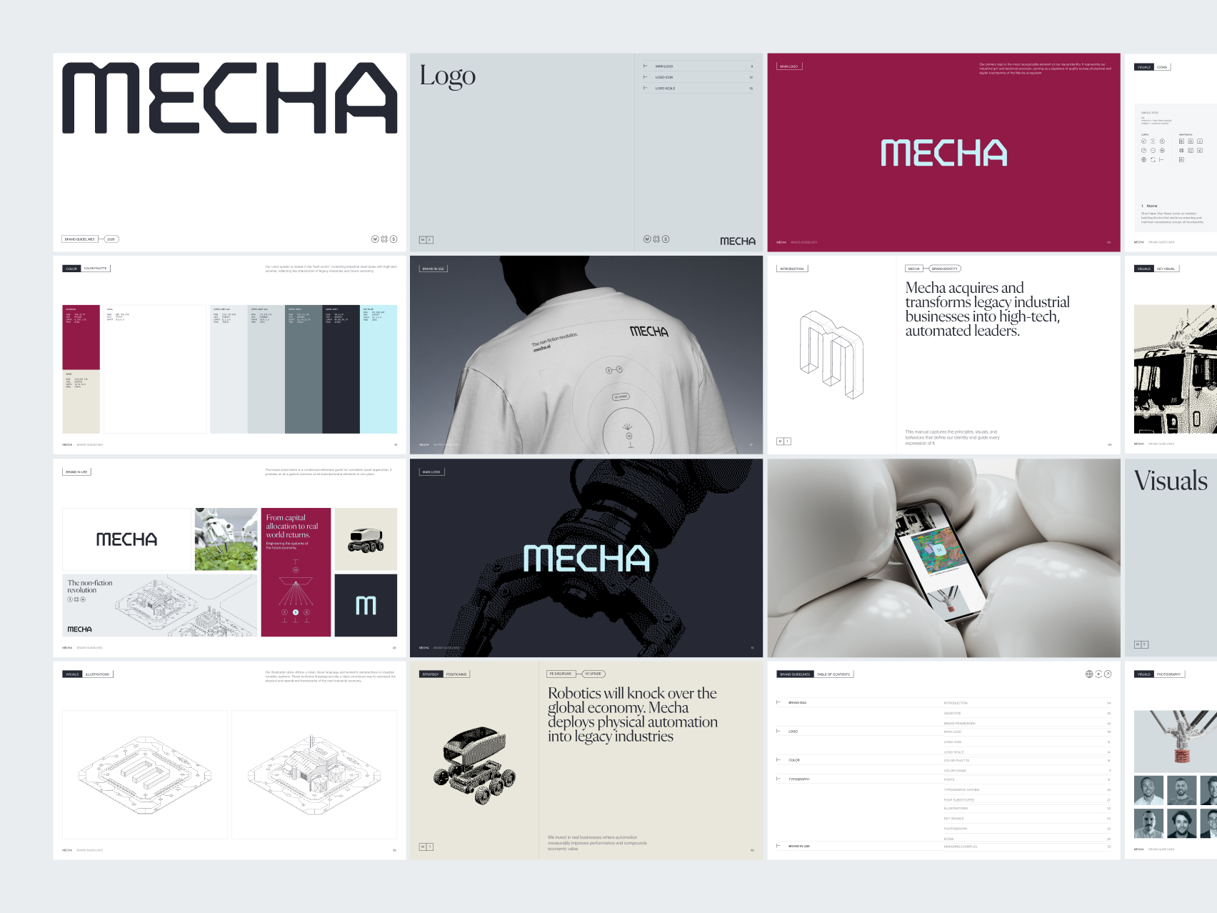
Strategy allowed us to evaluate these directions on something more useful than personal preference. Instead of choosing one visual world, we combined their strongest qualities into a single system: real photography as a language of facts, isometric illustration as a language for future systems, and dithering as the layer connecting both.
Photography as a language of facts
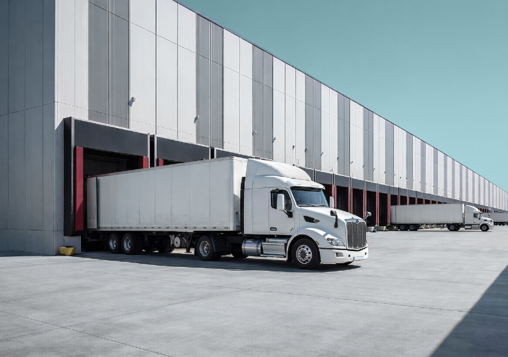
Photography has a specific role within the Mecha identity.
We show real factories, machines, robots, and industrial processes. They demonstrate that Mecha operates in the built world and works with technology that already exists, rather than serving as decorative backdrops for brand statements.
This is Show, Don't Tell made visual.
Photography helps establish the trust that industrial business owners and institutional investors can’t do without. It gives physical form to Mecha's thesis and proves that behind the language of automation are real assets, people, and operations. Yet photography alone couldn't meet every need of the brand: Mecha also has to communicate investments and systems that haven’t been built yet.
A new opportunity doesn’t always come with an existing factory or a library of documentary images - sometimes the investment thesis, operational model, and transformation plan come first, which is why we needed a second visual language for those moments.
Isometric systems for what can’t be photographed yet
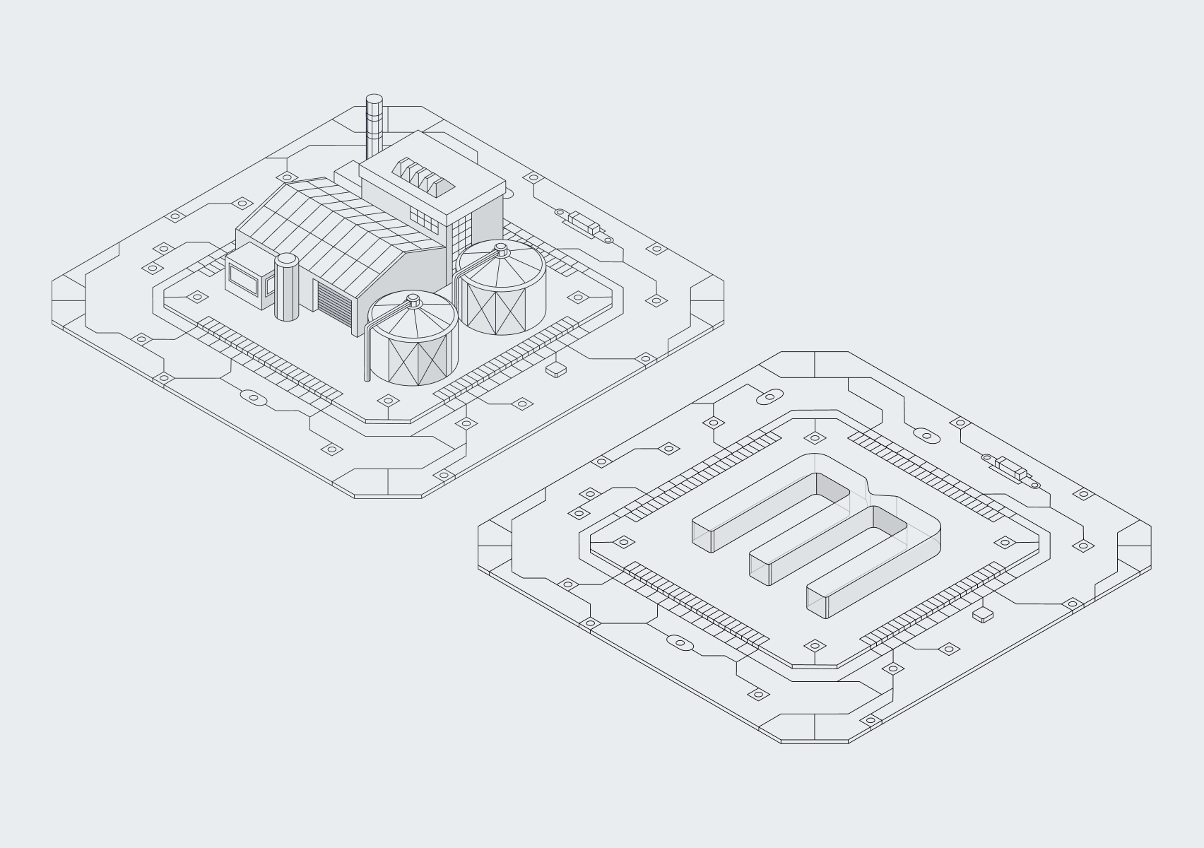
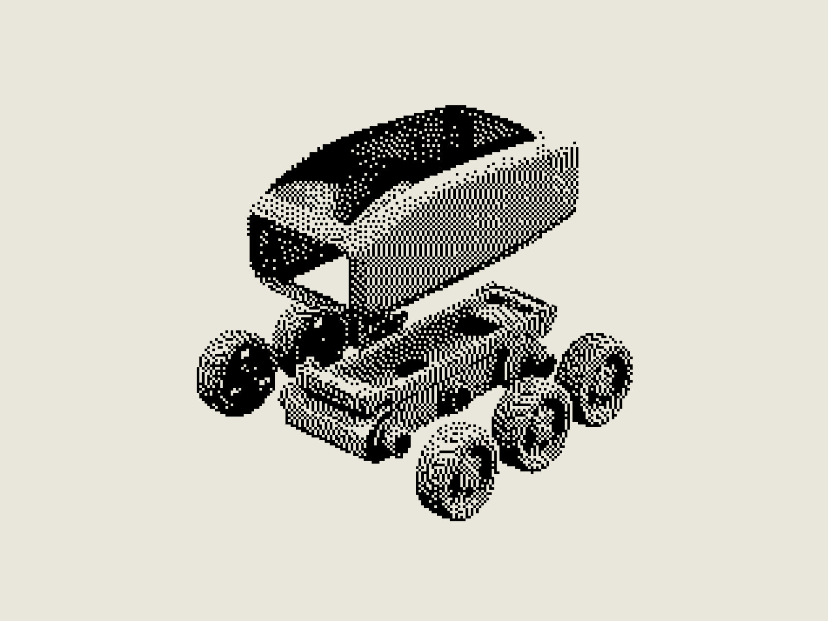
We created a system of linear illustrations based on technical drawings, blueprint logic, and isometric perspectives.
Factories, industrial installations, and pieces of infrastructure sit on structures resembling circuit boards and processors. The motif connects the scale of the built world with Mecha's engineering-first DNA, and also allows very different industries to be represented through one recognisable framework.
The illustrations stay independent of any specific machine or current state of technology, so they can depict a recycling facility, a logistics operation, a robotic wellness system, or an investment that currently exists only as a concept. That makes the system useful beyond the original launch.
Mecha can use these illustrations in pitch decks and investment materials while an operation is still in the conceptual phase. Once the investment becomes real, photography can continue the story.
One layer visualises what Mecha intends to build; the other documents what's already operating.
Dithering between the future and the physical world
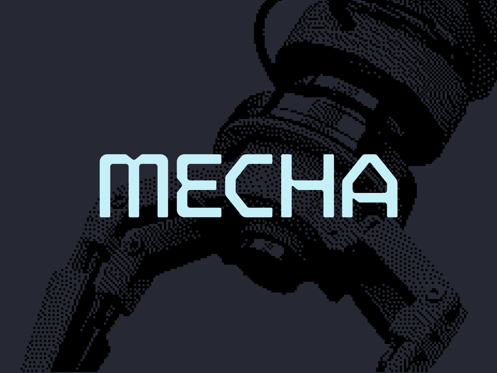
The third layer is a distinctive dither effect.
We apply it selectively to photography and conceptual imagery, allowing assets from different sources to function as part of the same visual system.
The treatment introduces a technological, slightly retro-futuristic quality. It references early computer graphics, machine displays, and the cultural world of Mecha without resembling another polished AI-generated render. Raw, digital, industrial.
We complemented it with small diagrams, annotations, and HUD-inspired interface elements. Symbols, arrows, labels, and technical measurements make the compositions feel like systems that can be examined rather than images created only to be admired.
Photography, illustration, and dithering work as one system: each supports a different stage in the life of an investment, together forming a flexible language for both vision and proof.
Academic minimalism instead of startup neon
The typographic system is led by Flecha M, a serif used for large editorial headlines.
Flecha brings something rarely found in conventional technology branding: academic authority. Its distinctive construction and sharp details work with the technical character of Mecha while giving the communication a more considered, intellectual tone.
That contrast mattered: Mecha works with robotics, but it doesn’t need to resemble a SaaS interface. It operates in the world of capital, research, industrial assets, and long-term value creation.
Flecha M carries the brand's voice. Neue Haas Grotesk Text Pro provides clarity, legibility, and structural hierarchy across supporting information. Together, they create a system that feels editorial, technical, and deliberately restrained.
We took a similar approach to colour.
Instead of the predictable green of finance or the luminous gradients of emerging technology, we introduced dark navy, warm cream, deep burgundy, and pale blue. The palette supports quiet, paper-like compositions as well as stronger, high-contrast applications.
An industrial grid and generous white space keep the system disciplined. Mecha can be recognisable without becoming loud.
A wordmark that activates the gripper
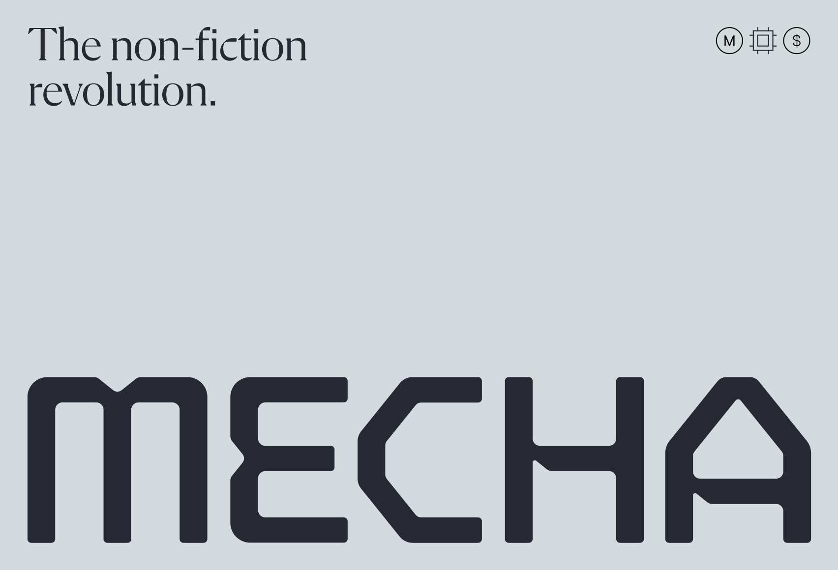
The central element of the identity is a custom MECHA wordmark designed from scratch. Artur Zawiasiński led this part of the project.
Technical cuts within the letterforms reference machinery, modular construction, and the visual culture of mecha. The wordmark feels futuristic, but its proportions remain stable and highly legible. We did not want the science-fiction reference to come at the expense of institutional confidence.
We also embedded a robotic gripper into the wordmark. In motion, the "C" behaves like a mechanical claw, closing without breaking the baseline and underlying geometry of the logo.
That detail quickly became one of the client's favourite parts of the identity:
“That logo animation is so good.”
The animation emerged directly from the construction and meaning already present in the static mark.
The full wordmark can lead the communication, while the distinctive "M" functions independently as a monogram, icon, illustrative element, and animated object within the digital experience.
The website as a synthesis of the brand
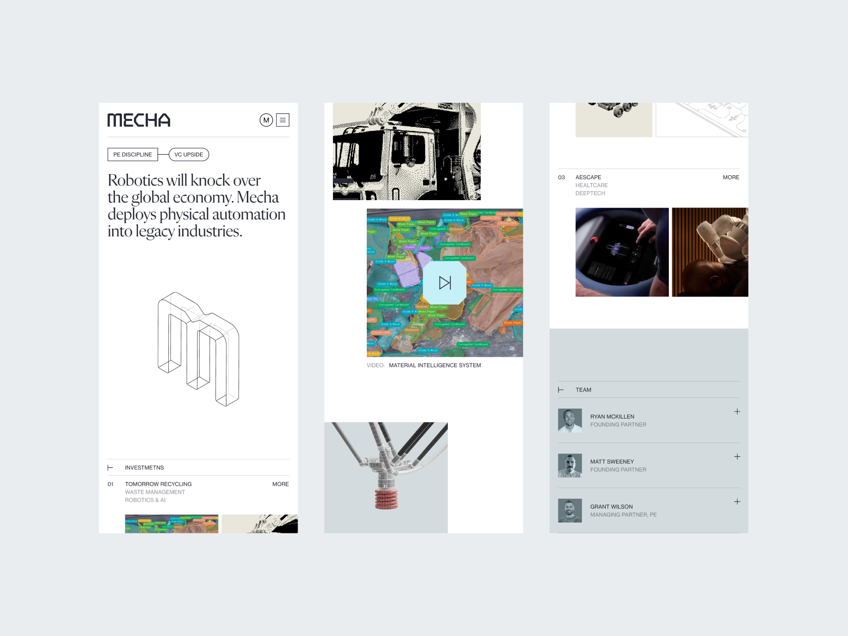
From the beginning, we treated the website as the fullest expression of the strategy.
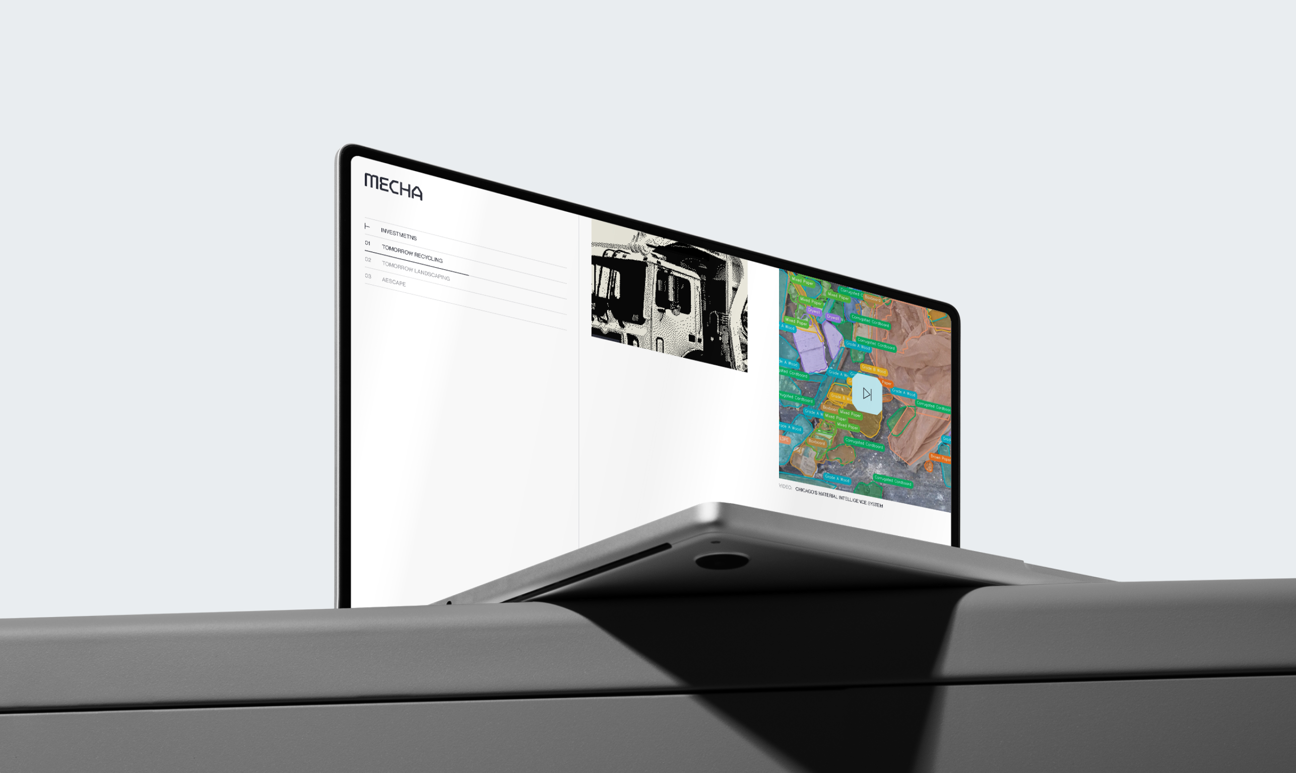
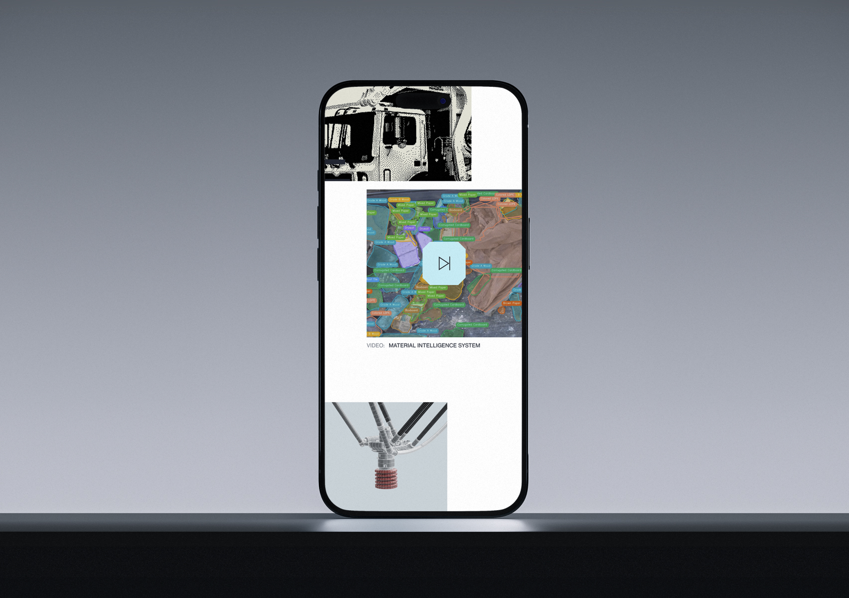
We paid particular attention to mobile: typography, hierarchy, interactions, and motion were all refined specifically for the smaller screen, rather than compressed down from the desktop layout.
Large Flecha M headlines establish an editorial rhythm. Generous white space gives the investment thesis room to breathe. The industrial grid organises complex information, while motion introduces technological energy without turning the site into a showcase of disconnected effects.
Mecha needed a digital experience capable of presenting a complex business model with clarity, high-tech efficiency, and institutional confidence, and not another loud technology website.
After seeing the first mobile preview, the client was thrilled. And on top of that, the website was built to support the company's long-term growth.
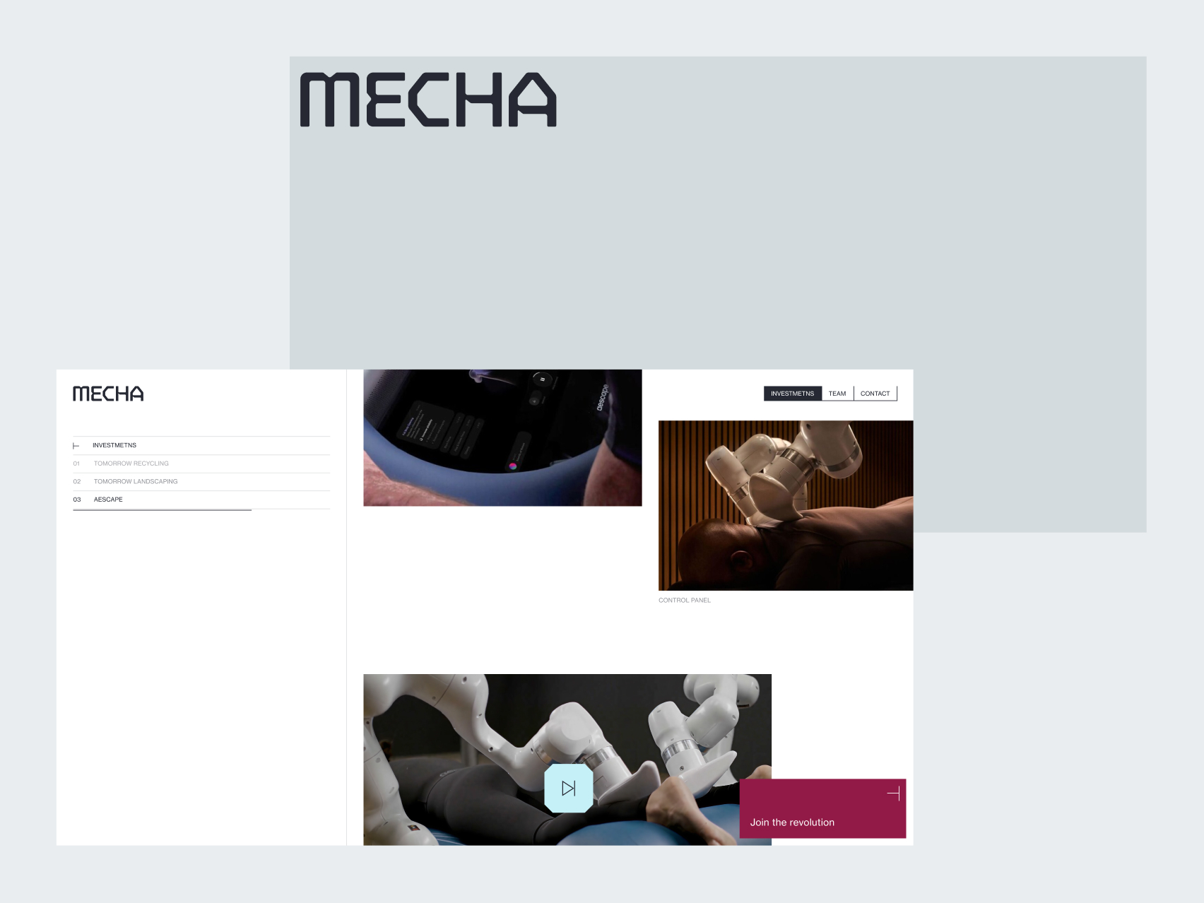
Portfolio company names are anchored in the left-hand column, while the modular investment structure allows new entries to be added without changing the fundamental logic of the page. The website can expand with Mecha's portfolio instead of requiring a redesign after every acquisition.
A full brand creation lifecycle
The project covered the complete creation of a new brand around an existing name: strategic workshops, positioning, messaging, the wordmark, visual identity, Brand Guidelines, presentation materials, LinkedIn assets, and the website.
Each element had a different role, all of them following the same strategic axis.
Photography built trust; isometric illustration made future investments visible; dithering connected vision with proof; typography introduced academic authority; the wordmark encoded Mecha's robotic DNA; and the modular website created room for the portfolio to grow.
The result is a system that ties every asset together.
The Mecha team can build new pitch decks, present investments before they launch, document them once they become operational, and add them to an expanding portfolio. They use the same visual language every time.
What strategy actually made possible
Had we skipped the strategy, we still could’ve created a well-designed identity for a robotics investment firm.
It might’ve featured a robotic arm, a dark interface, and dollar-green accents, or looked impressive in isolation.
But it would’ve repeated the same category codes that weakened Mecha's credibility in the first place. Instead of a clear signal, it would’ve become part of the noise.
Strategy gave Mecha:
- Beyond the hype
The Non-Fiction Revolution shifted the story from speculative promises to operating businesses and real-world returns. - One strategic filter
Every direction, image, typeface, and interaction got evaluated against the same problem, not personal preference. - Vision and proof
Isometric illustration shows what Mecha intends to build. Photography documents what is already operating. - Built to expand
New pitch decks, acquisitions, and portfolio stories slot in without reinventing the brand each time.
The outcome is a coherent language for communicating what Mecha has already built and what it intends to build next.
Shortly after launch, the client wrote:
“We've had a lot of compliments already.”
It’s an early sign that the new brand landed.
That's what strategy made possible: reason behind every element.

.png)