


Social engineering is behind some of today's biggest breaches, and yet, no one was protecting the human layer.
Humanix set out to change that with an
AI-powered platform that detects and responds to social engineering attacks in real time, across multiple channels including voice, chat, and help desks.
.jpg)
Introduction
We ran a full Brand Discovery Workshop with the founding team. Golden Circle, audience mapping, positioning, competitor analysis, brand values - everything we needed to answer the core questions first: Who is Humanix for, what makes it different, and what space does it own? The answers shaped everything that followed.
The challenge
The challenge went further than designing a brand. Humanix was defining a new category, and we wanted to help them make it feel inevitable.

.jpg)

Wordmark + Icon
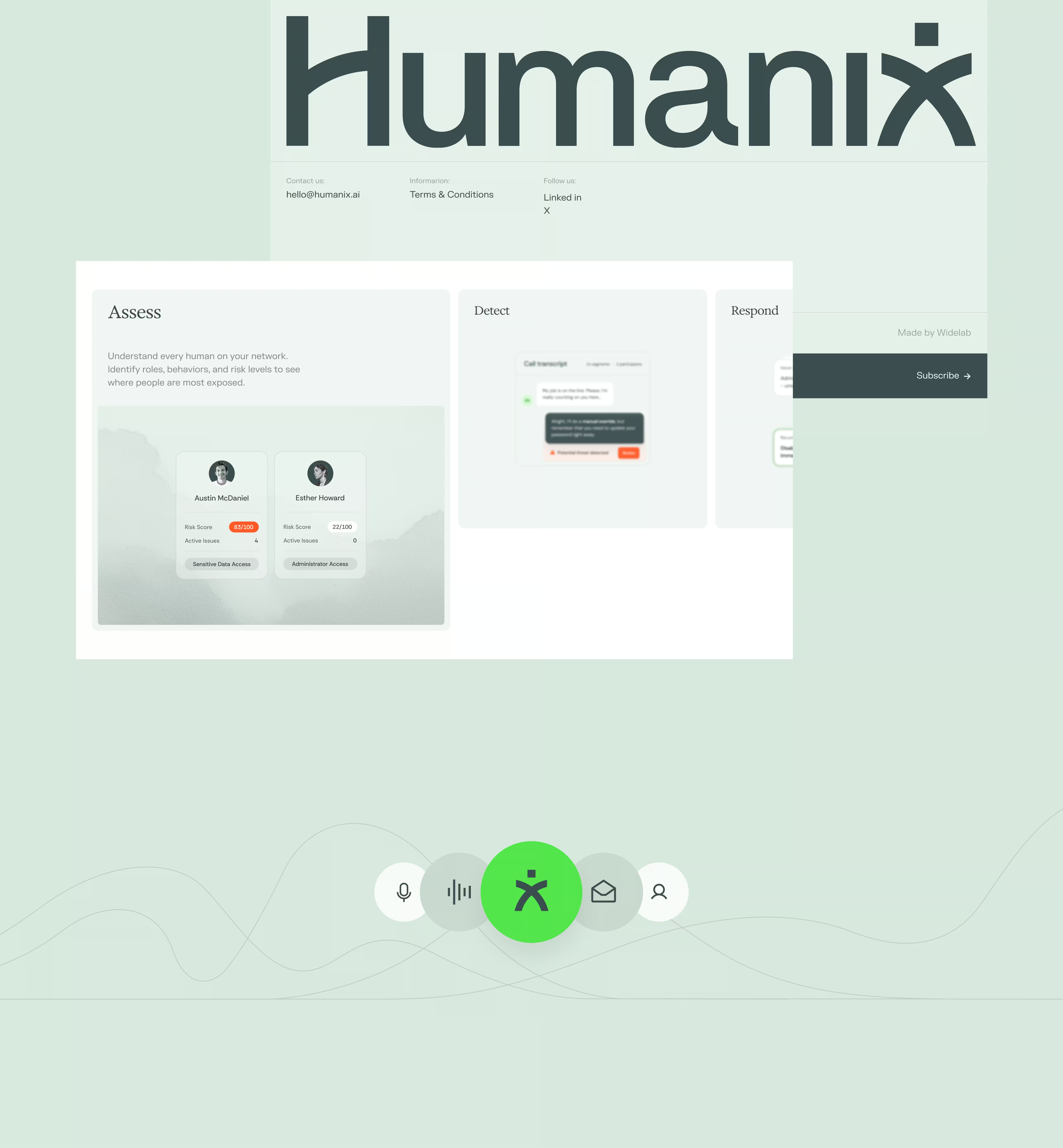
The icon draws from a stylized version of the letter ‘x’, built to resemble the person that Humanix is looking to protect. The angular accent on the ‘H’ creates a circular, all-encompassing visual to symbolize the protective layer that the brand offers.
The wordmark was designed to convey security, warmth, and highlight the humanity behind Humanix, whilst emphasizing the technology behind the solution.



System
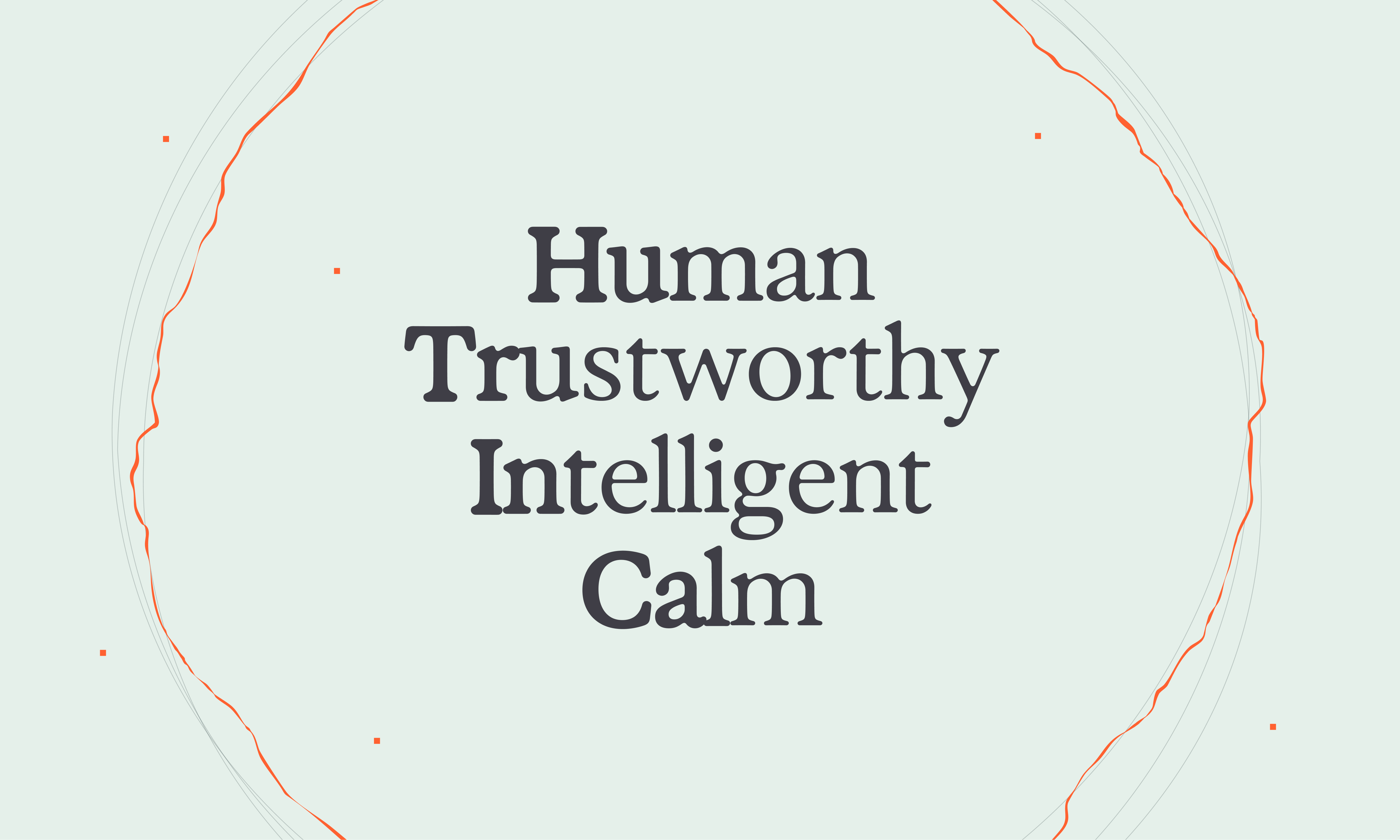
The Humanix brand system is built around their core values: Human, Trustworthy, Intelligent, Calm.
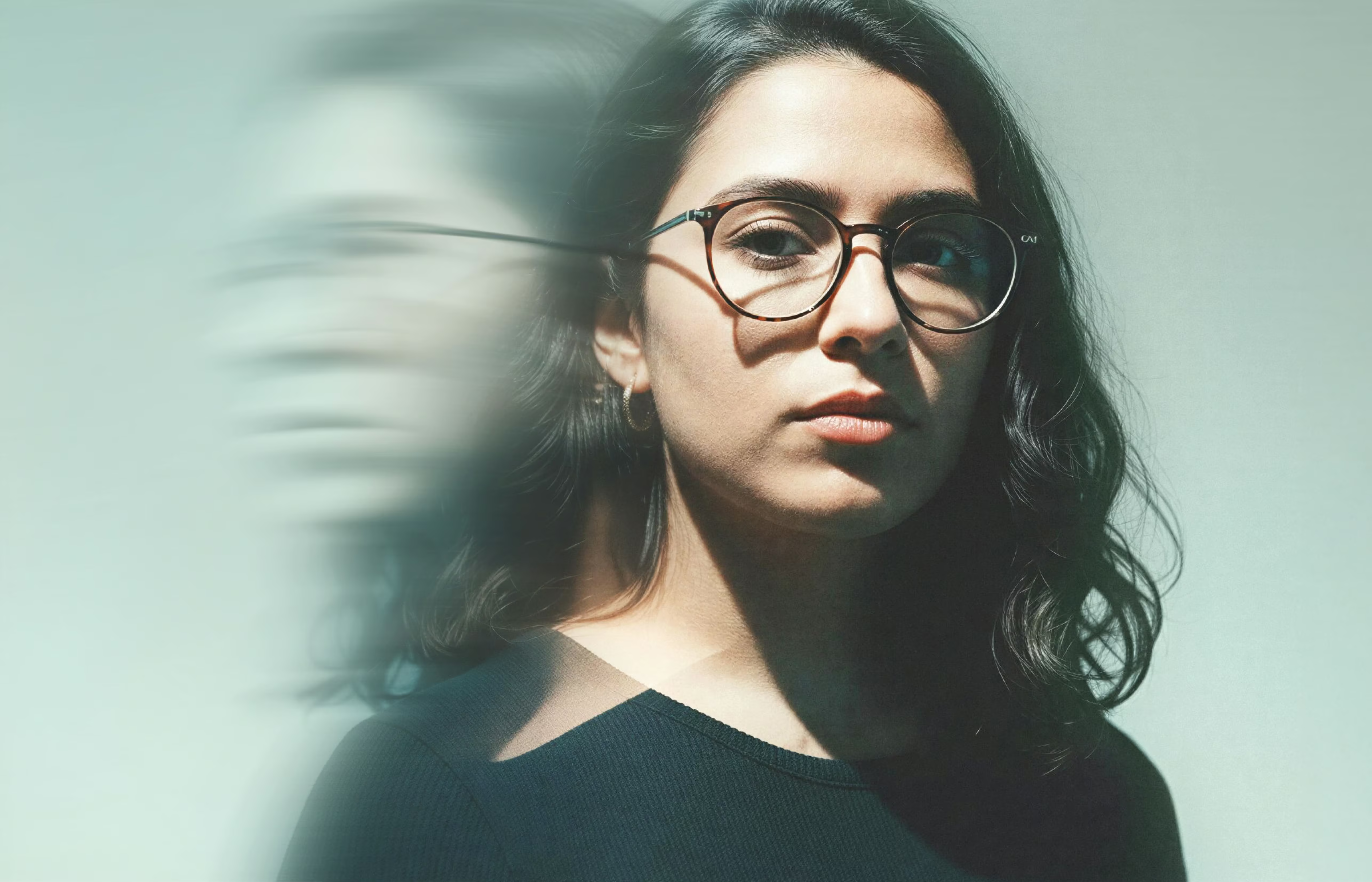
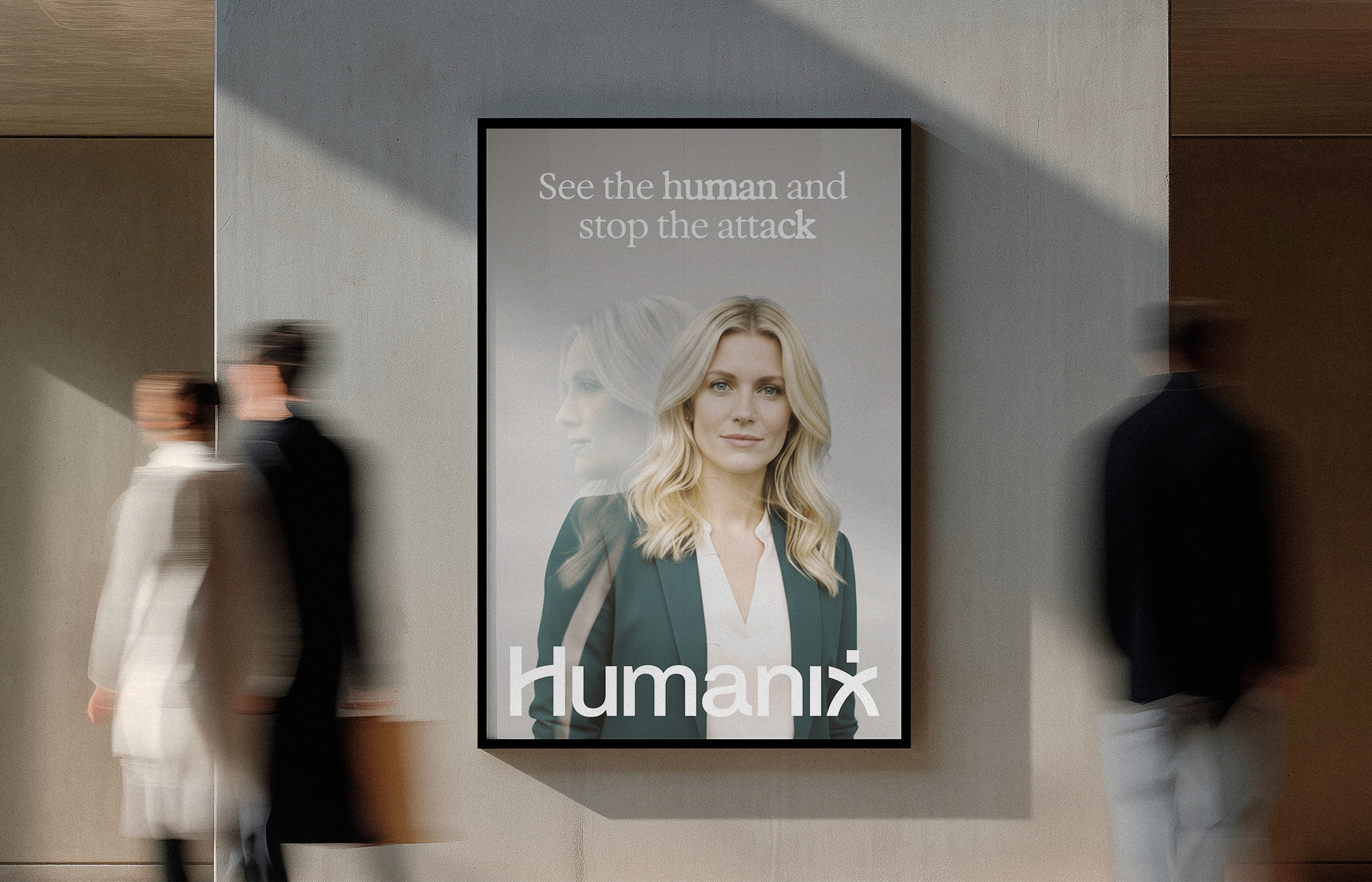
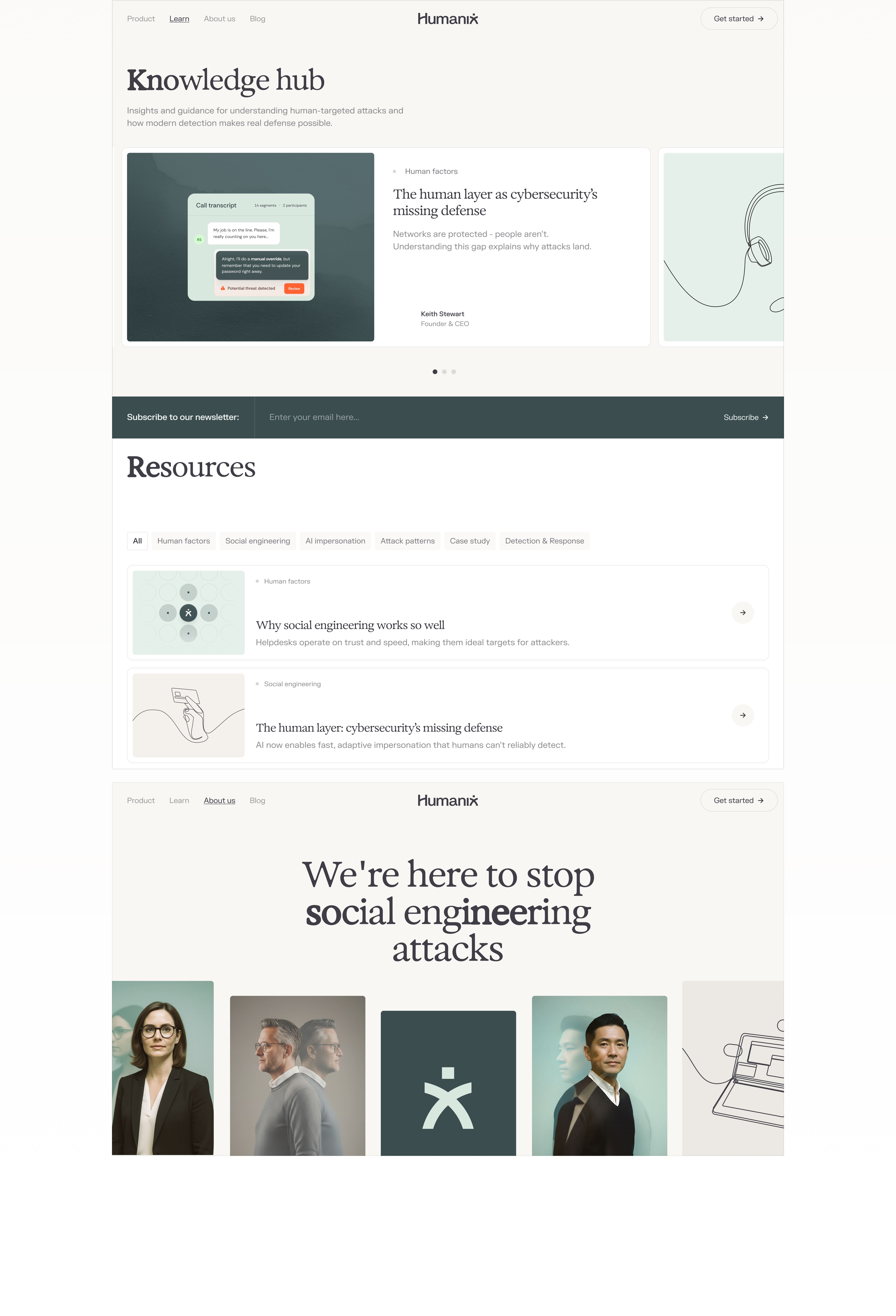
Everything from the unique colour palette to the signature wordmark and font style was about highlighting security and awareness of risk to the user. The key was keeping the system as approachable as possible, to retain the sense of humanity in each asset.
.avif)
.avif)
.avif)
.jpg)
Brand palette
With a reassuring colour palette ranging from soft Mint through warm Chalk to Graphite and energetic accents of Emerald and Coral, the palette is all about conveying calm rationality underpinned with strong technology.
The accent colours serve a clear purpose: Coral represents alerts and potential threats, while Emerald signals trust, protection, and successful resolution. Together, they visually reinforce Humanix's promise of turning uncertainty into confidence.



Font
Typography balances humanity with technology. The Exposure font adds warmth through its organic forms. Letters in headlines subtly grow heavier and lighter to evoke soundwaves and the continuous analysis of human communication.


Summary
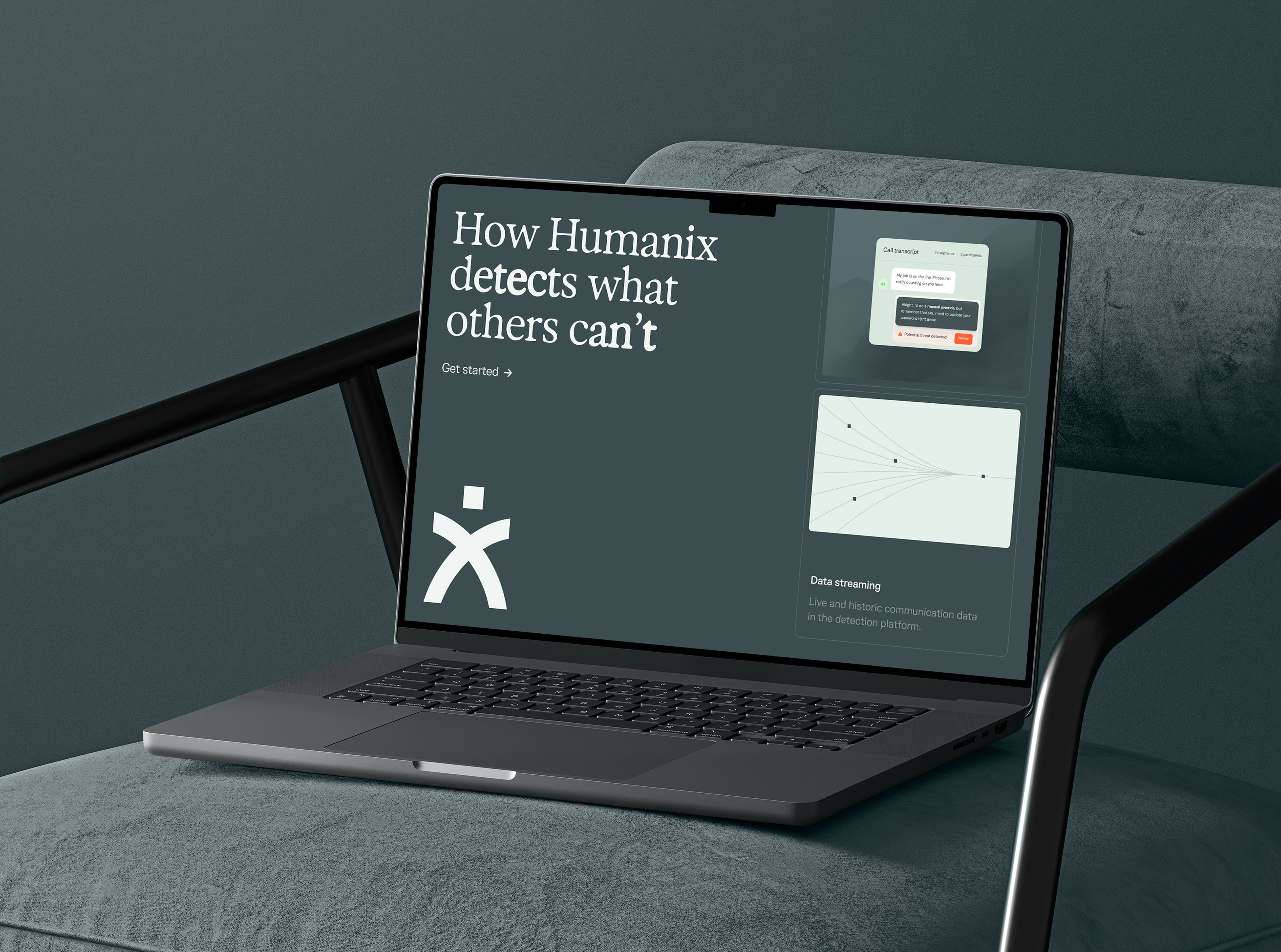
Humanix is dedicated to protecting human users from advanced AI agent attacks across a variety of channels and surfaces. Their brand now conveys the keystones of what they do and envision: a calm, authoritative, intelligent company that engenders trust, all while staying as human as possible.
Artur Zawiasiński,
Michał Roszyk


